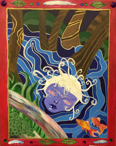
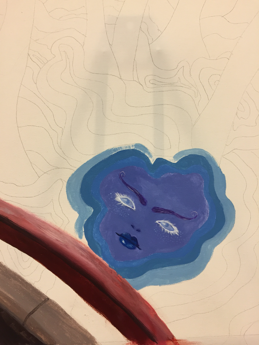
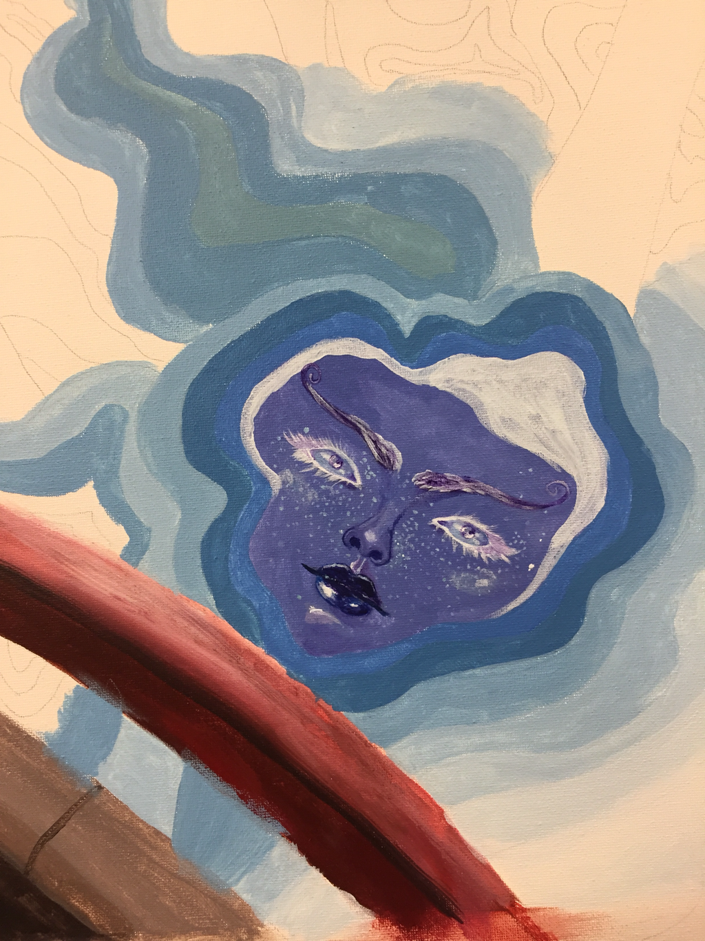
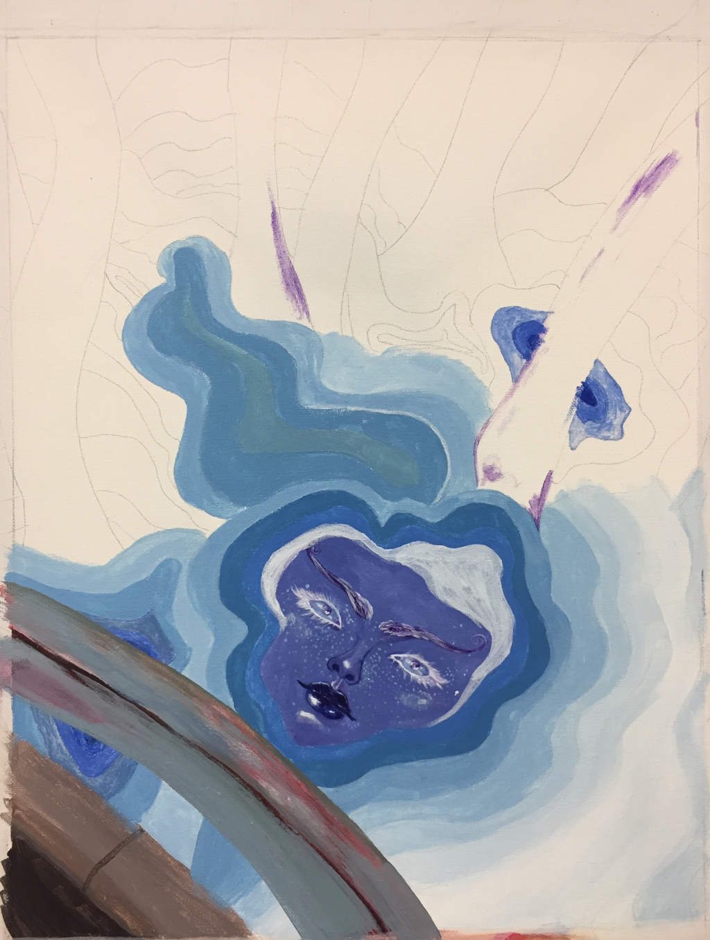
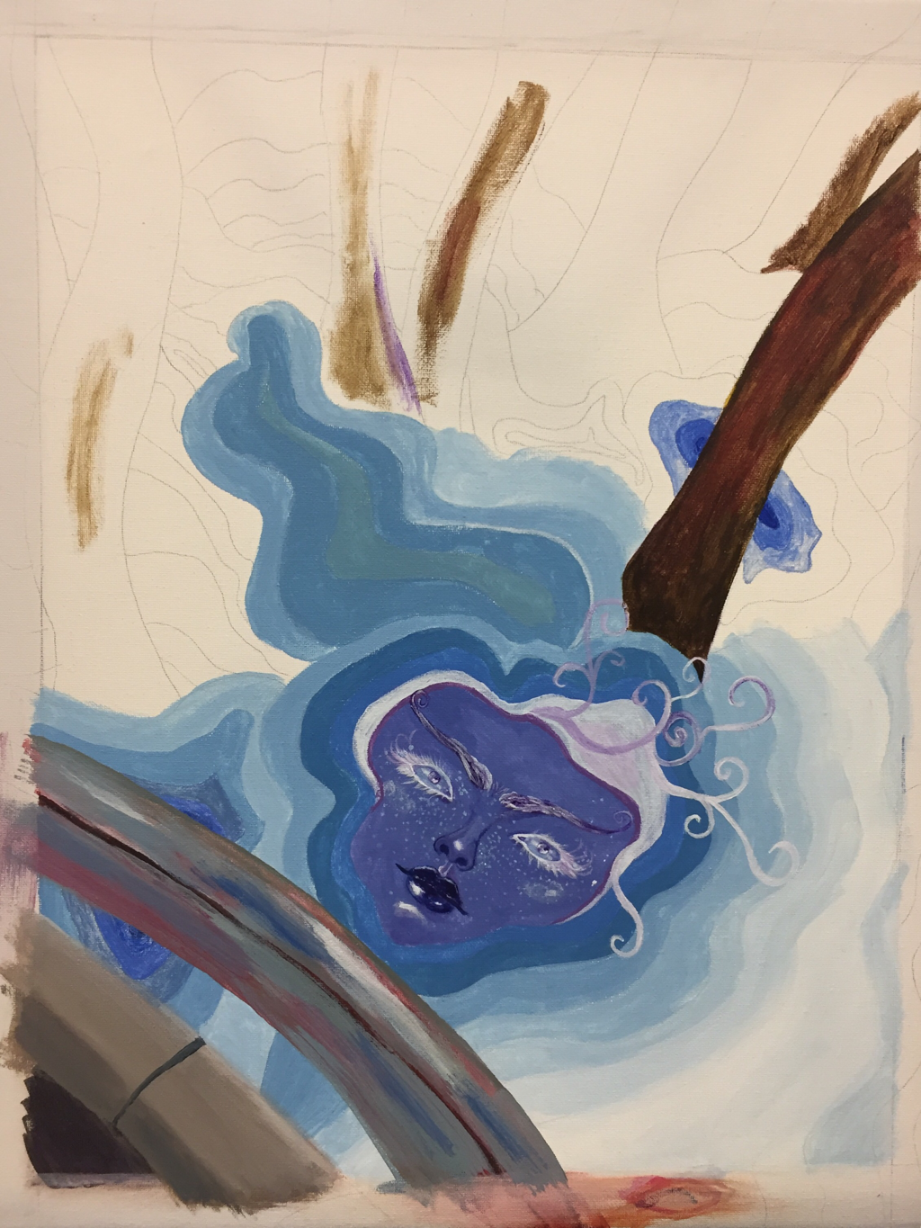
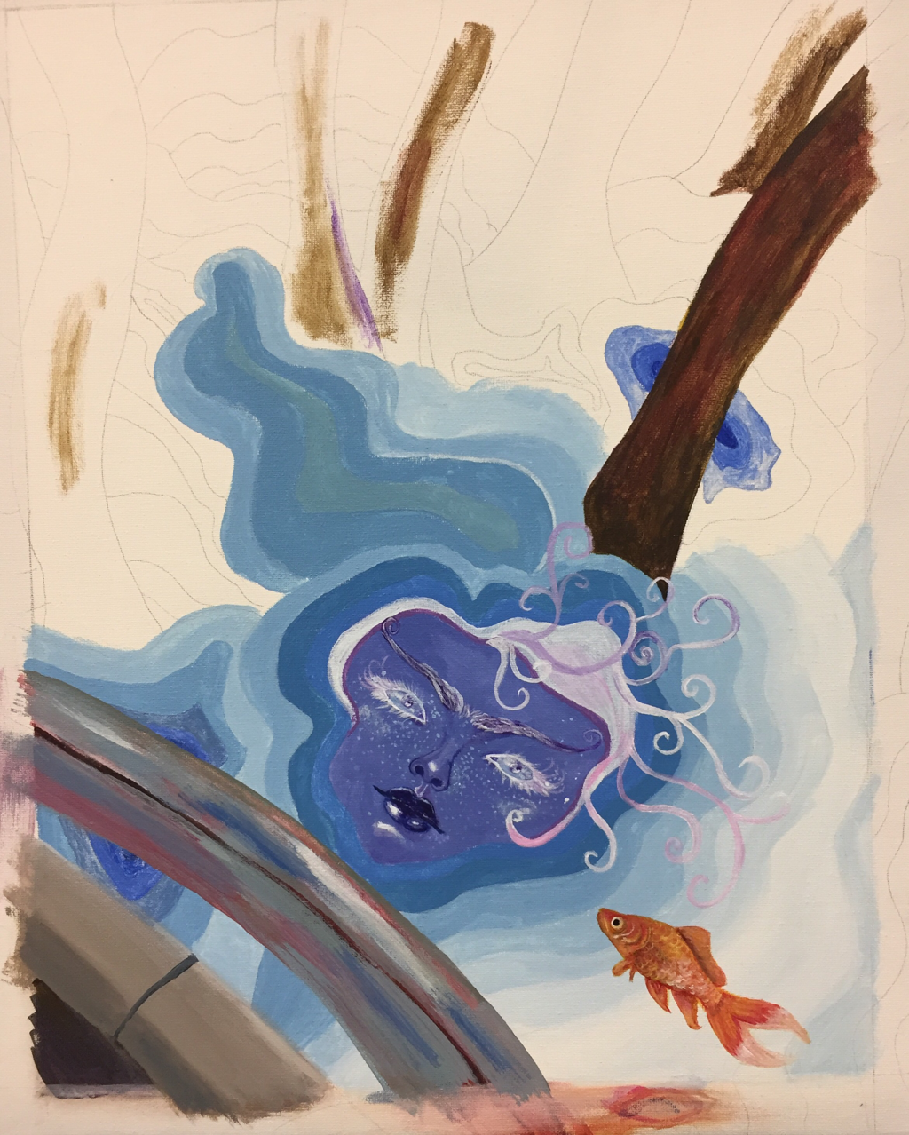
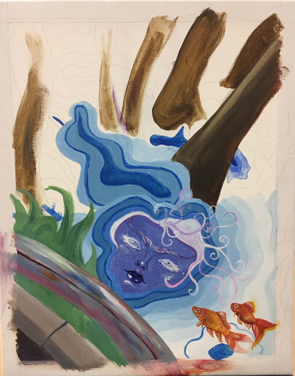
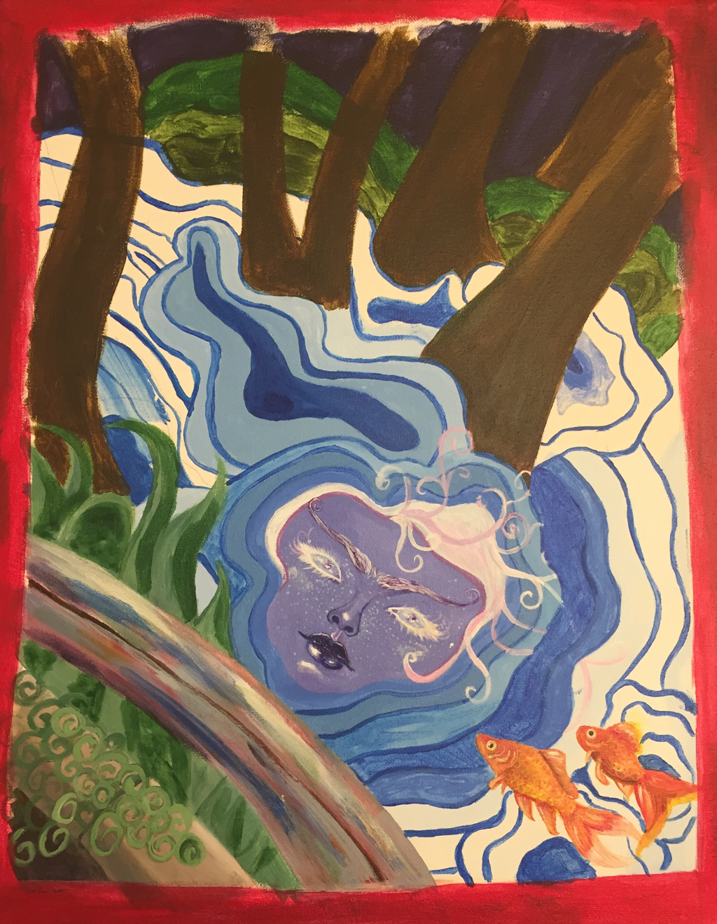
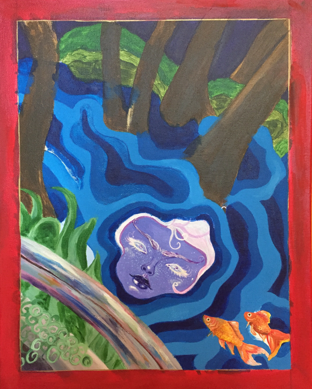
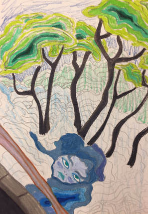
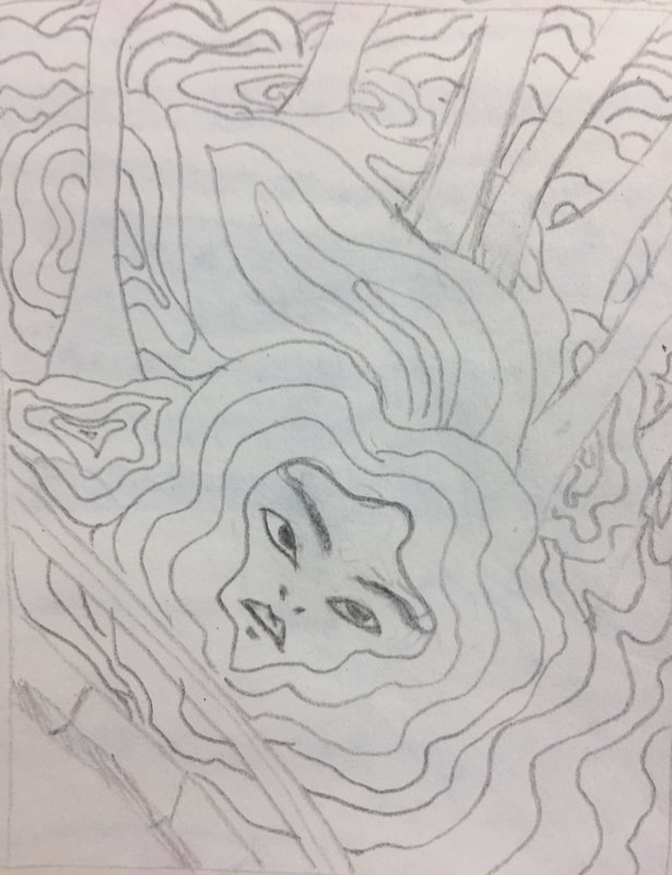
 1.) Describe the craftsmanship of your painting. (Is it neat and well executed?) I like the way this painting turned out. The lines and colors flow well, and it looks pretty similar to the way I imagined it. I like the way the goldfish look against the water. I incorporated different styles into the painting to make it more interesting and give a collage-like appearance, and, in my opinion, it worked out. 2.) How does your work embody the artist’s style? I used simpler shapes in my painting, with flat colors. There isn't any shading on the face, and I outlined the different features instead of blending them into the skin. I also included a center with patterns radiating out from it. 3.) Describe your choice of colors/color harmonies and how you used them throughout the artwork. I tried to put complimentary colors next to each other when I could, like I did with the orange fish against the blue background. I also utilized simple colors, like plain blues, greens, and reds. I only used one type of blue, mixed with white, for the water. The green plants aren't a very realistic shade. They're brighter and stand out more in the foreground. 4.) What is the emphasis (focal point) of your artwork? The face is the focal point in the painting. The waves ripple away from it, and the goldfish face towards it. I tried to make the colors on the face more complicated than the colors through the rest of the painting. The eyes are pale, which brings more attention to the red eyelashes and the dark lip color. The hair takes up a lot of space, and sticks out instead of flowing down. 5.) How did you use textures and patterns to embellish your artwork? The most obvious patterns are in the water, the plants in the background, and the trees. They're simple patterns, so they stand out the most. The swirly leaves in the foreground are also a pattern, and so are the curls in the hair. The goldfish are almost a pattern. If I had added one or two more they would have repeated enough to be considered a pattern. 6.) How did you put a border on your artwork? How does it enhance the work? I created a red border lined with a gold marker, and I put leaves and clouds inside of it. I embellished the border with sequins, 2 pieces of gold star confetti, and buttons. I think it makes the colors in the painting stand out more, since they are mostly cool colors, and it brings the warm colors in the painting forward a bit. 7.) Describe any difficulties you had creating this artwork. Getting the lines right was difficult when using a paintbrush. I had to paint over a lot of the waves, because I accidentally got different shades of blue on them. I also had difficulty with the hair, and I would've liked to do more with it. The lighting makes the glitter in the hair look green, so I think adding some pink streaks through the hair and more curls would improve the appearance. Here are the sketches I did for this project:
0 Comments
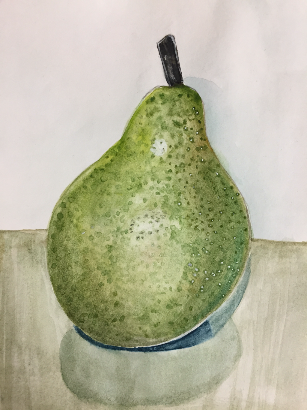 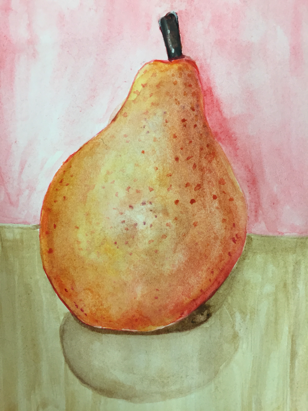 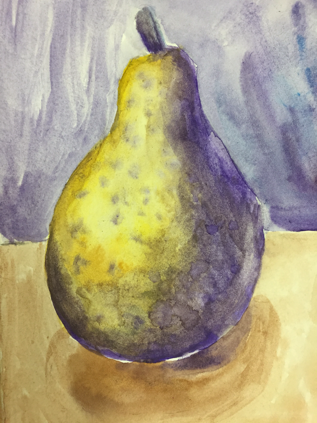  These are my watercolor pairs. The colorschemes are monochrome, warm colors, complimentary colors, and cool colors. I liked working with watercolor, but I didn't like the way the paper warped so easily.
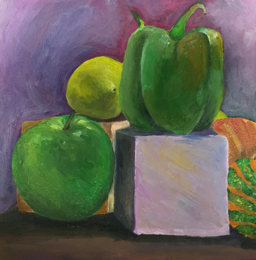 My favorite part of this still life is the lemon. I used purple, green, and brown for the shadows and I think those colors mixed well with the different yellows. I like using oil paint because you don't need as many layers and it dries slower, which makes it easier to blend, but it makes it easy to blend too much as well.
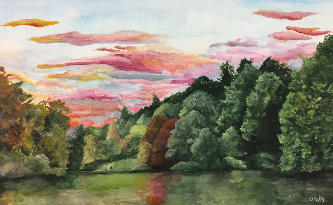
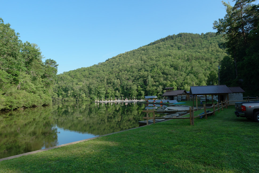
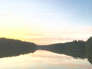
5. Describe your craftsmanship. I spent awhile on this painting, and I think it turned out the way I wanted it to for the most part. The leaves are very neat on the right because I spent more time on them, but the leaves on the left aren't bad. I think the sky turned out really nice. 6. If you were able to do something different what would it be and why? I would add darker colors to the water and improve the reflections. I heard that lighter trees have darker reflections and darker trees have lighter reflections, presumably because of the way the light hits them. I would like to improve the way the reflections look when I have time. 7. Explain to me what you have learned about watercolor and how it has improved or discouraged your development in art. I learned new techniques for watercolor painting, and I learned how to keep the paper from warping. Now that I know more about watercolor I would like to work with it more often. Here are the references I used that belong to me:
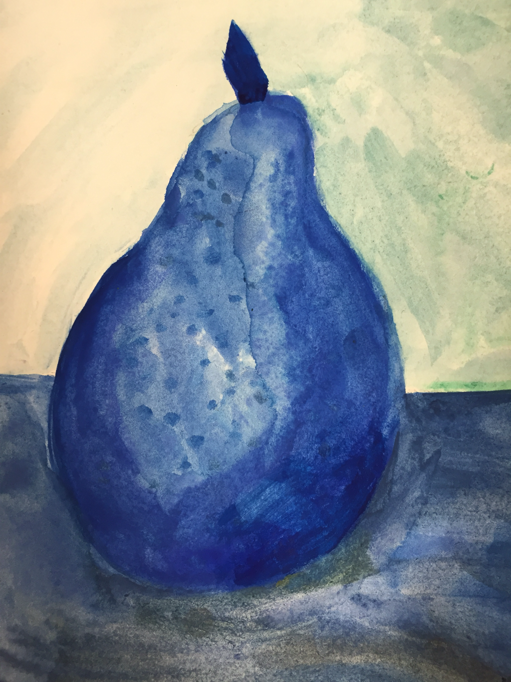
This is the practice painting I did: 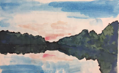 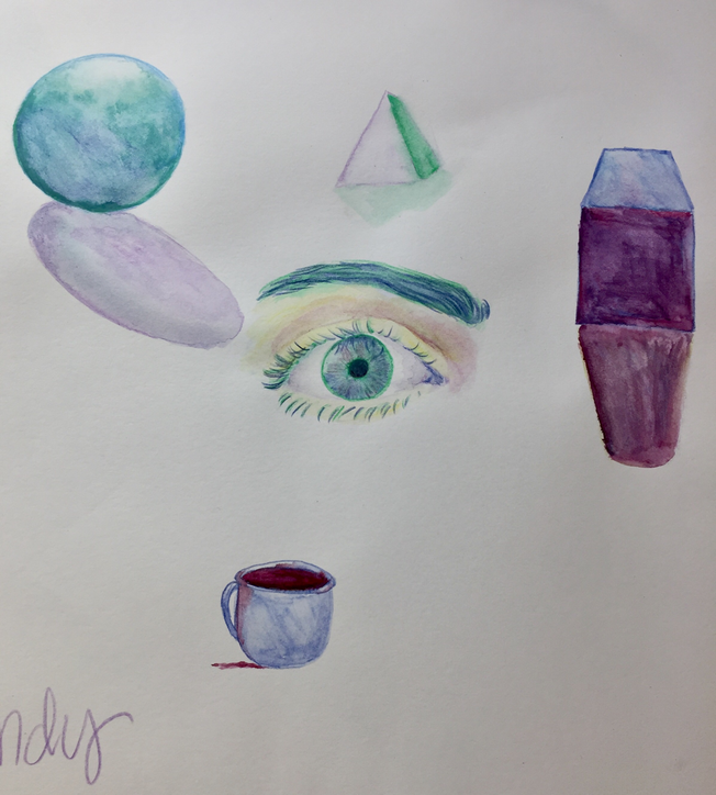 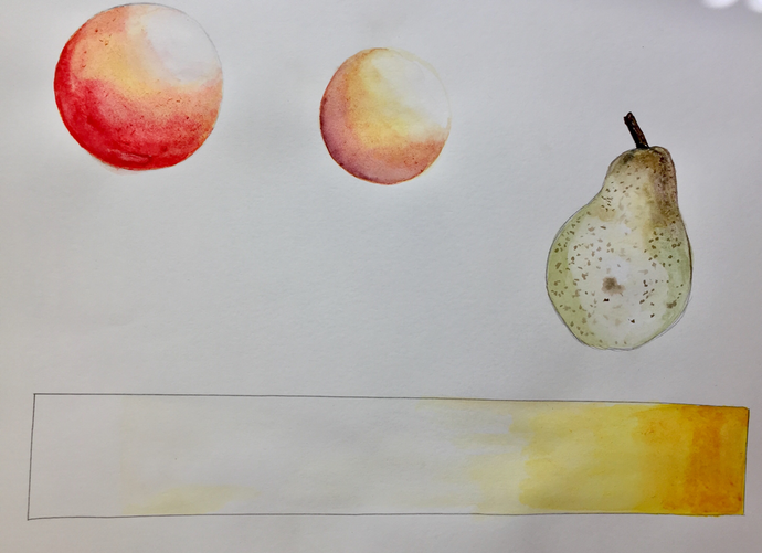 This is the practice I did with different shapes, and the pear I did to practice for the final pear paintings.
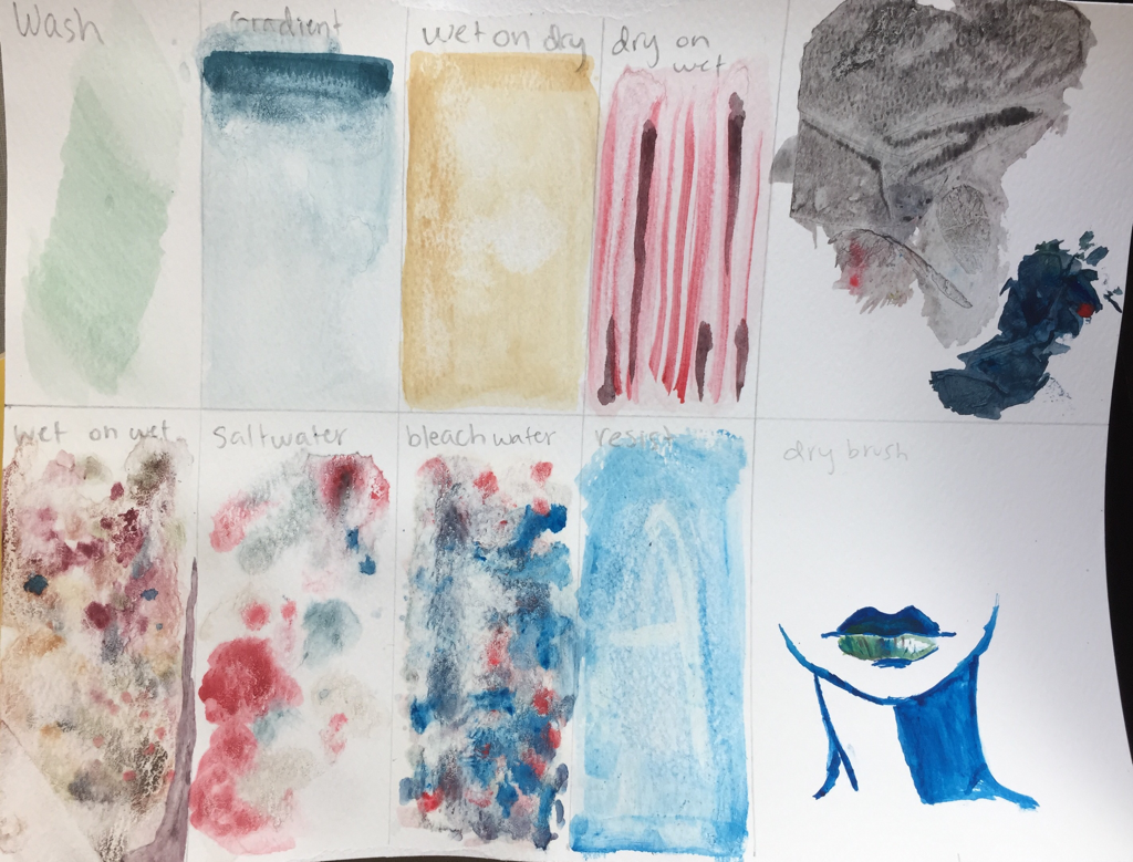 These are the techniques we practiced in class. Some of them got smeared because they were too wet when I put them away, and the paper warped a lot. I liked the saran wrap because of the way you could manipulate the paint.
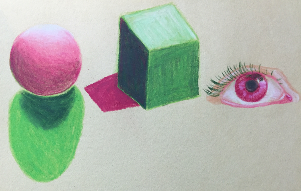 These are the shapes I did with prismacolor. I also did an eye because I wanted to practice drawing something more natural, with different types of shading.
|
AuthorWrite something about yourself. No need to be fancy, just an overview. ArchivesCategories |
 RSS Feed
