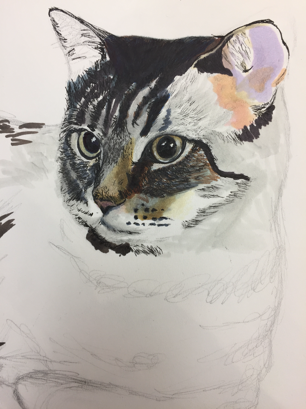
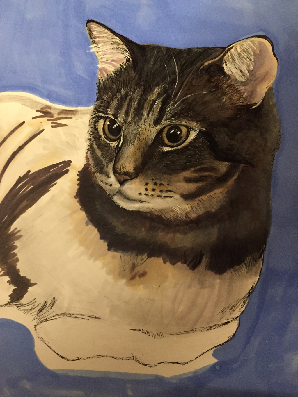
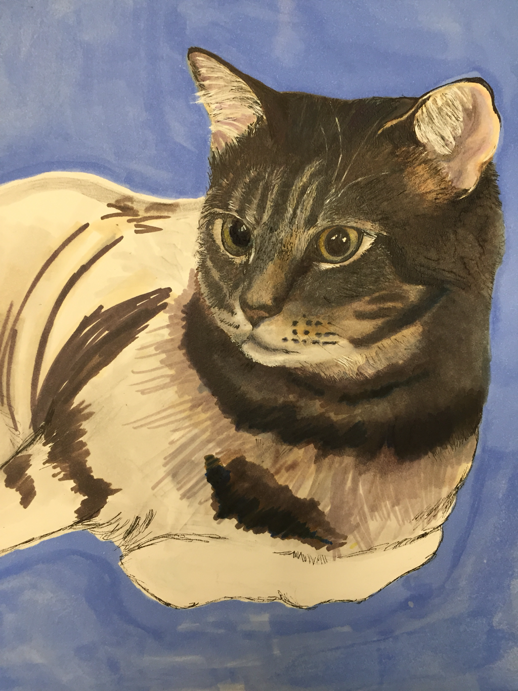
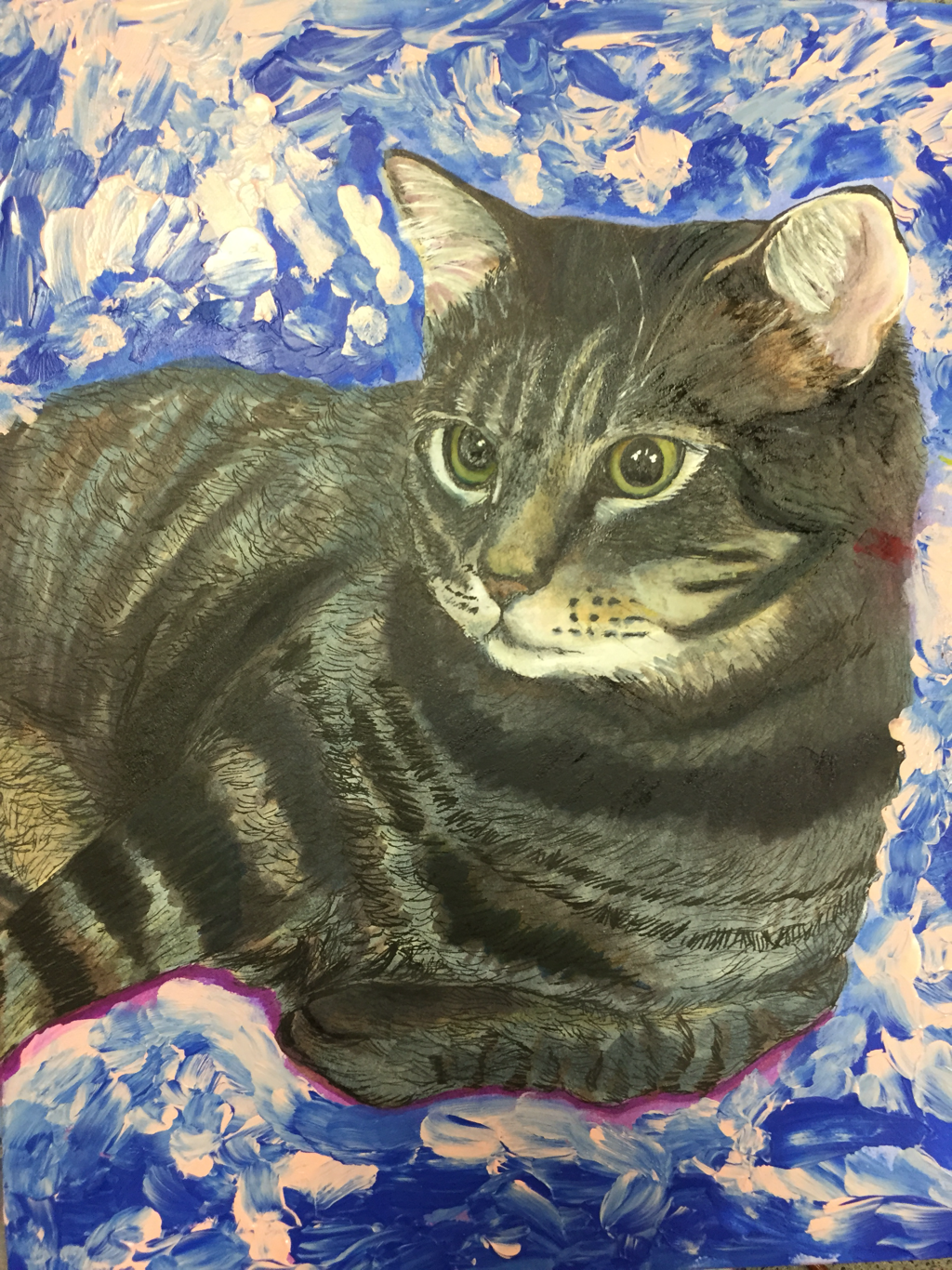
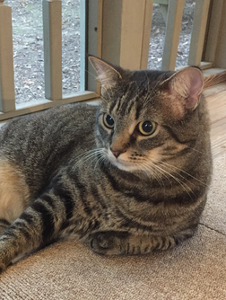
This is my pet portrait. I don’t have the final picture right now, but I did it in marker, pen, and acrylic. I used this picture of my cat as a reference:
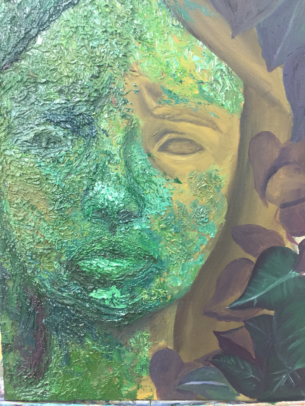
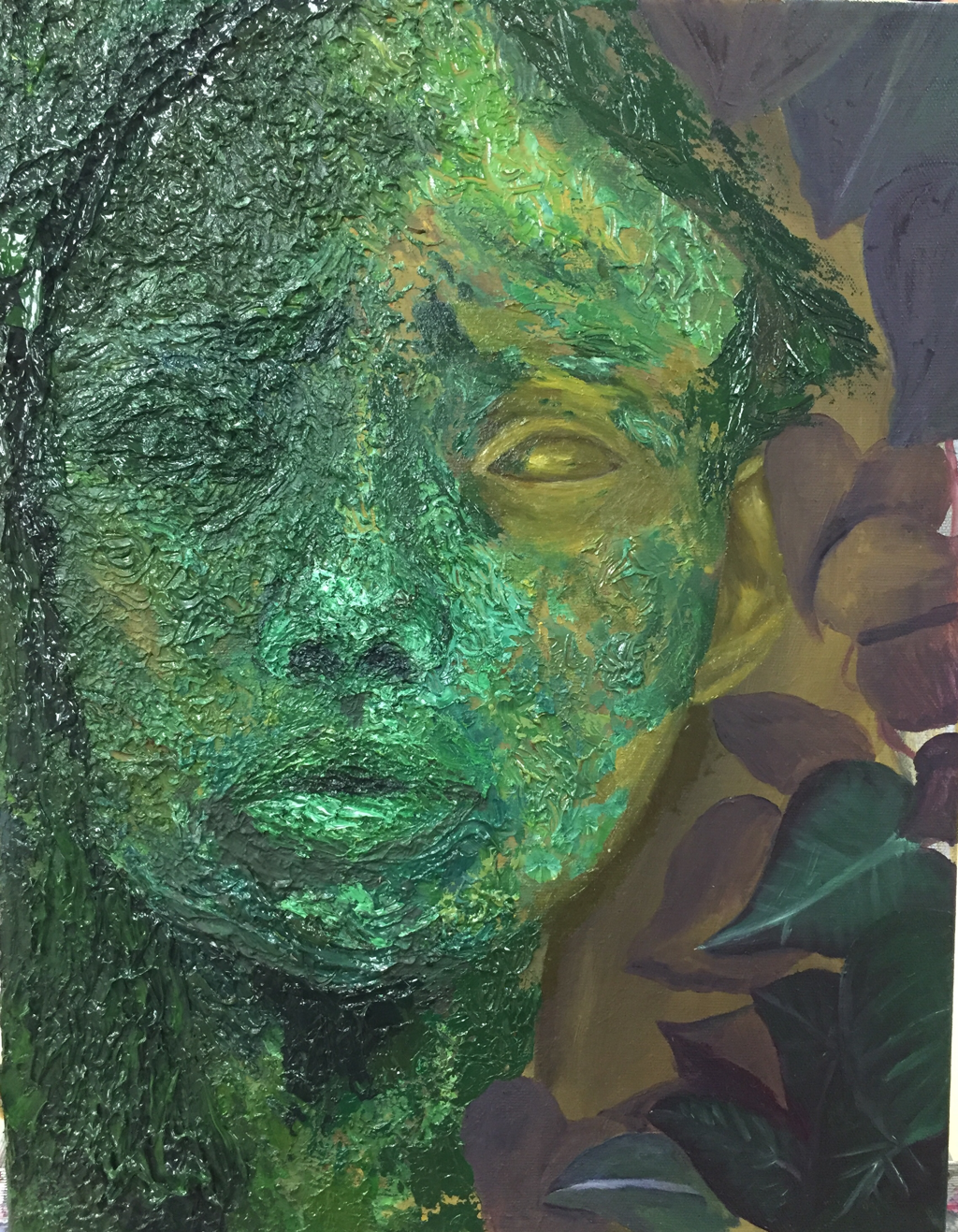
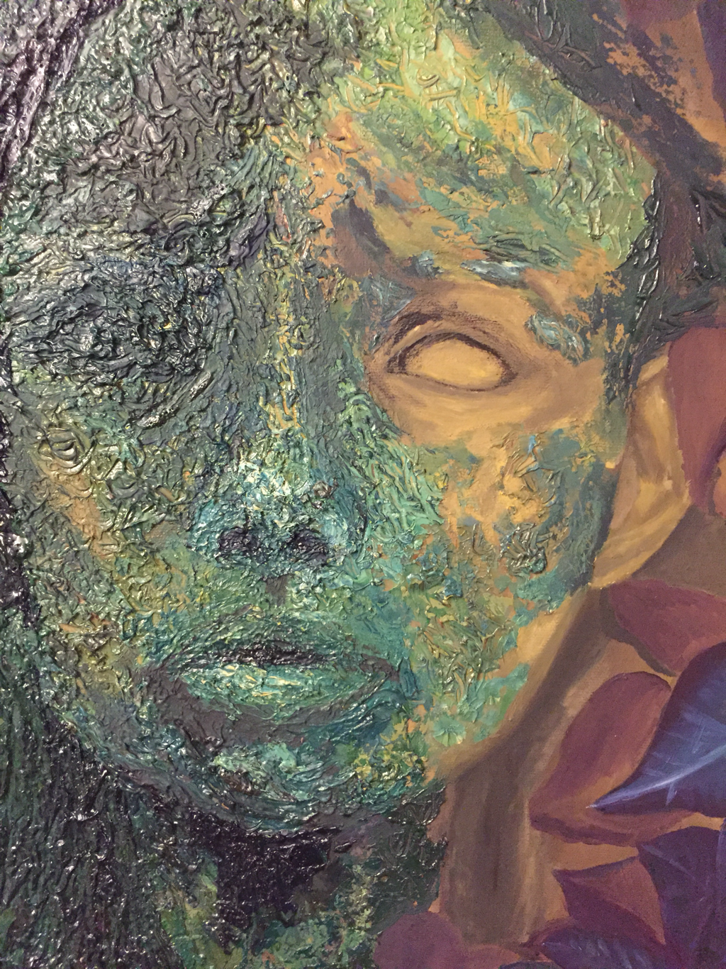
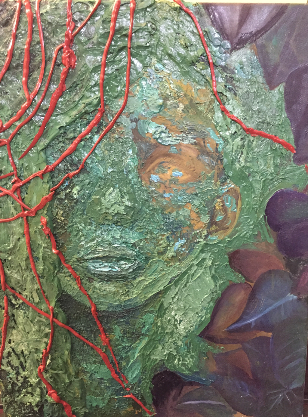
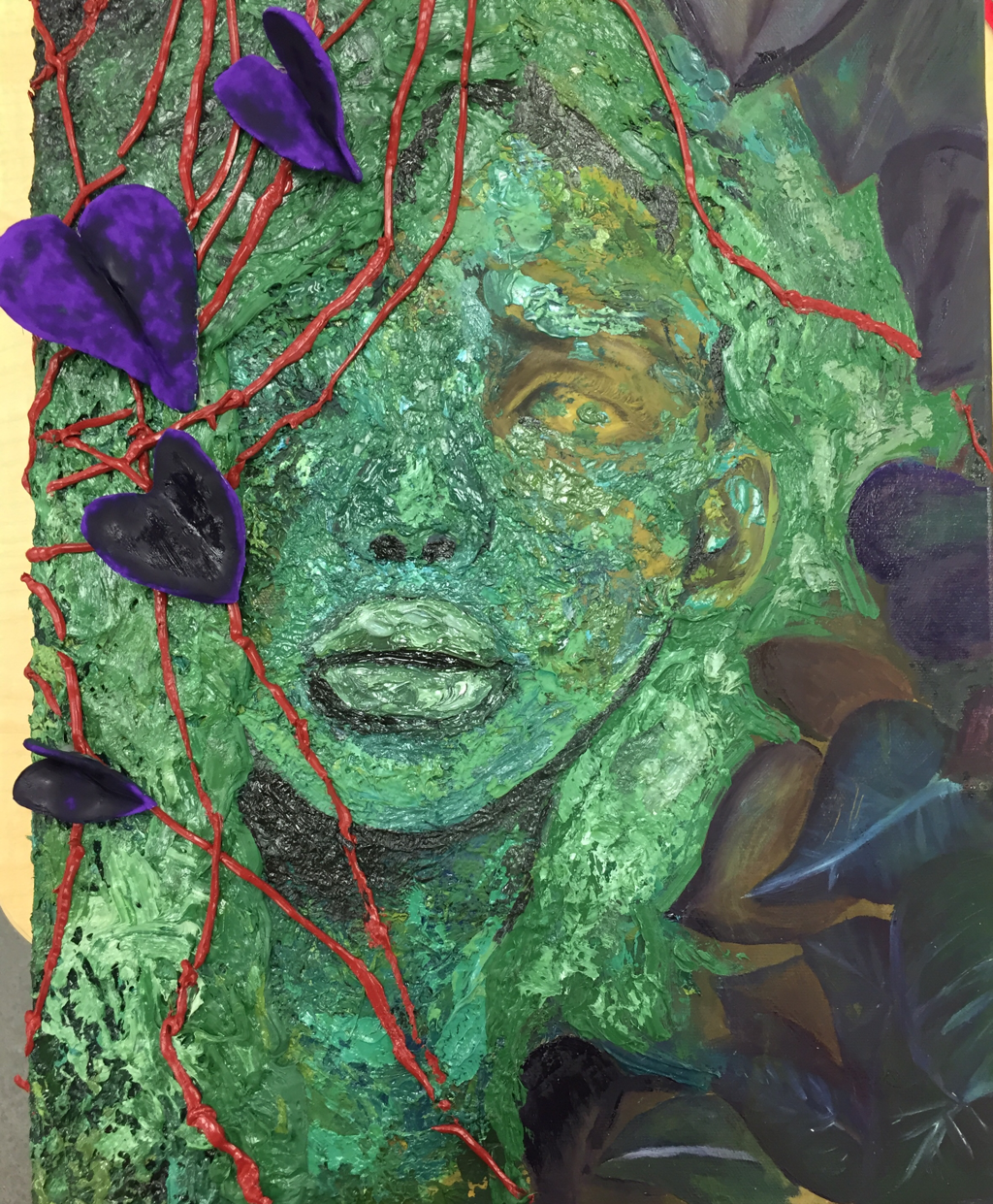
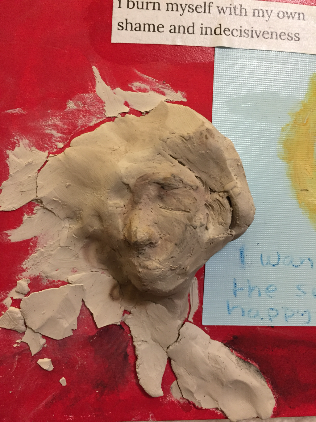
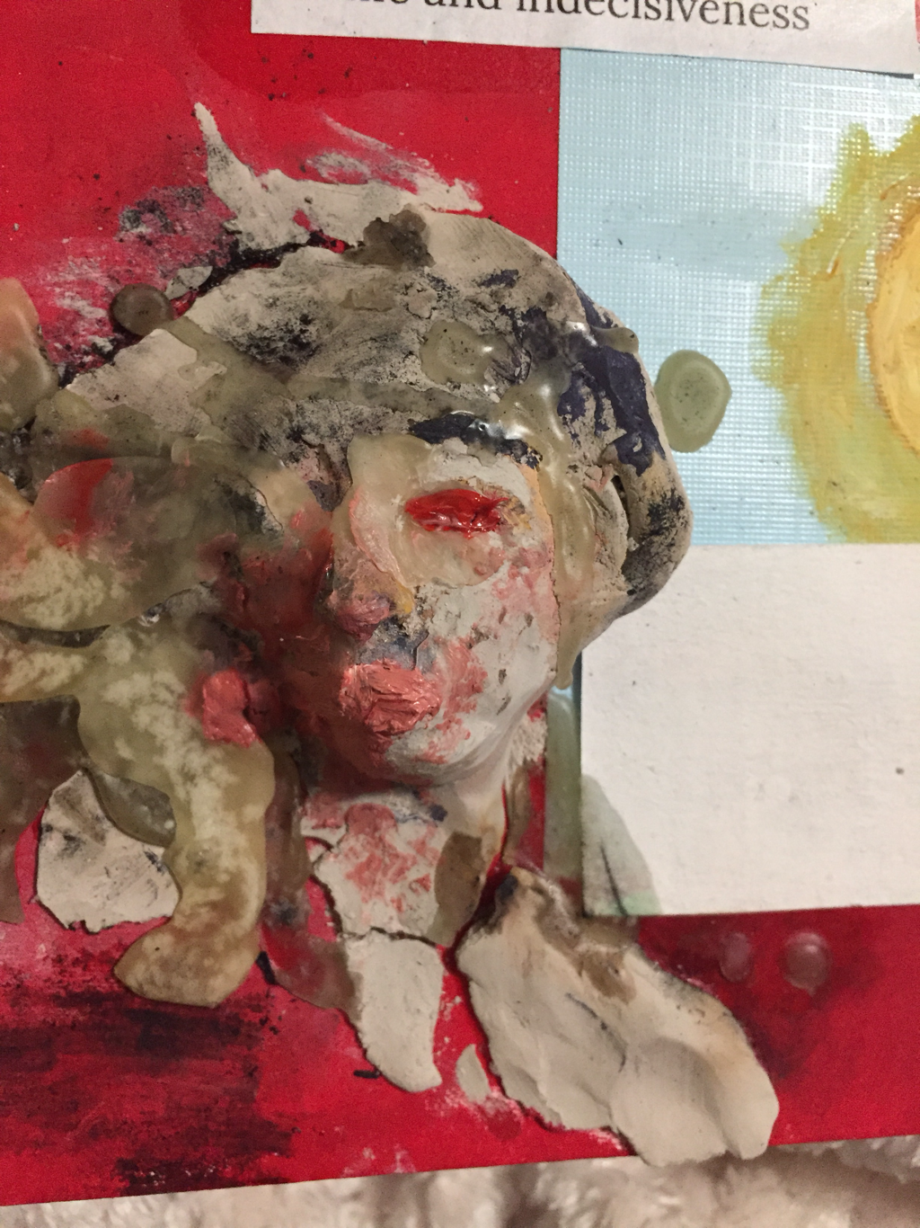
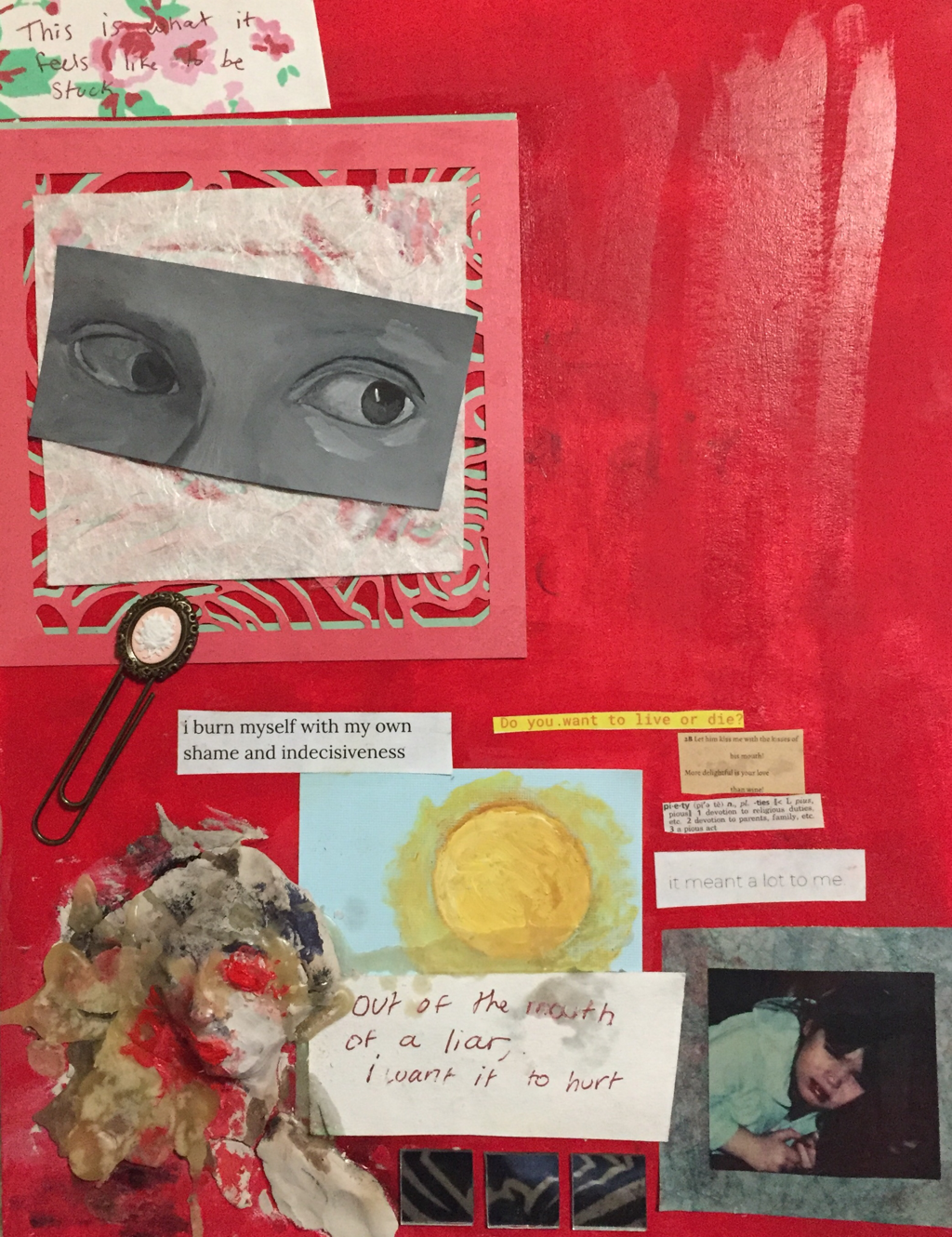
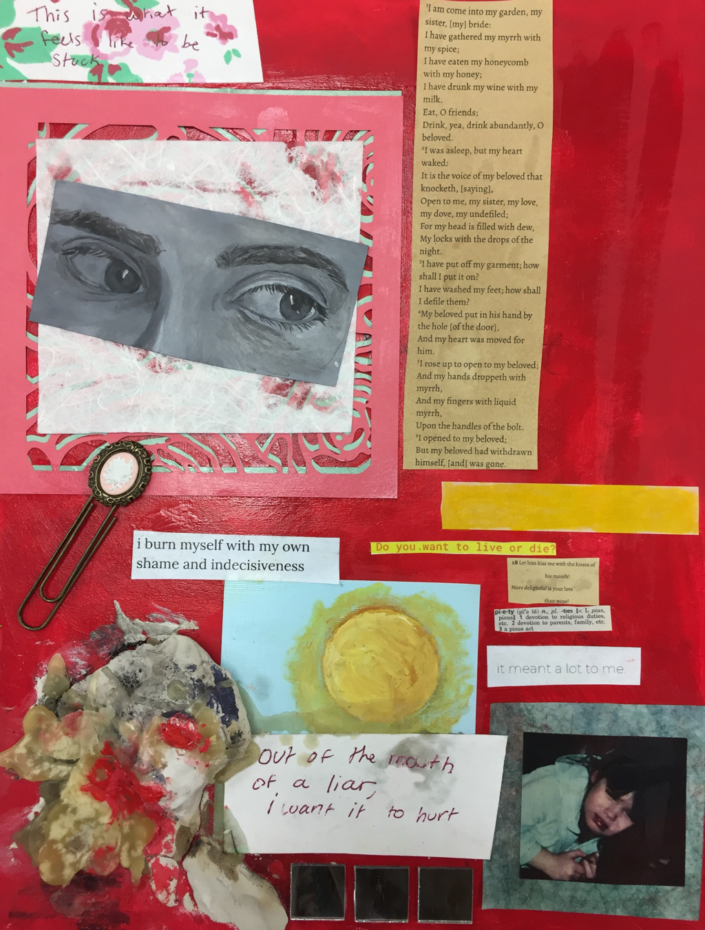
My concentration is inspired by my own journal entries, and this particular piece draws on my Catholic baptism and my interest in the Renaissance, and also my depression. I need to finish the painting of the eyes, but they are my own, sans glasses. The face in the bottom left corner is made of clay, wax, and oil paint. It looks like it was on fire at one point because it was. There are dictionary definitions, quotes from “Song of Solomon,” and some bits of my own poems and thoughts. I included a clip I got from Michael’s 3 years ago, mirrors, and a picture of myself from when I was about 3. I plan to add more blocks of text so I can paint or draw over them.
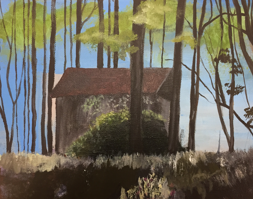 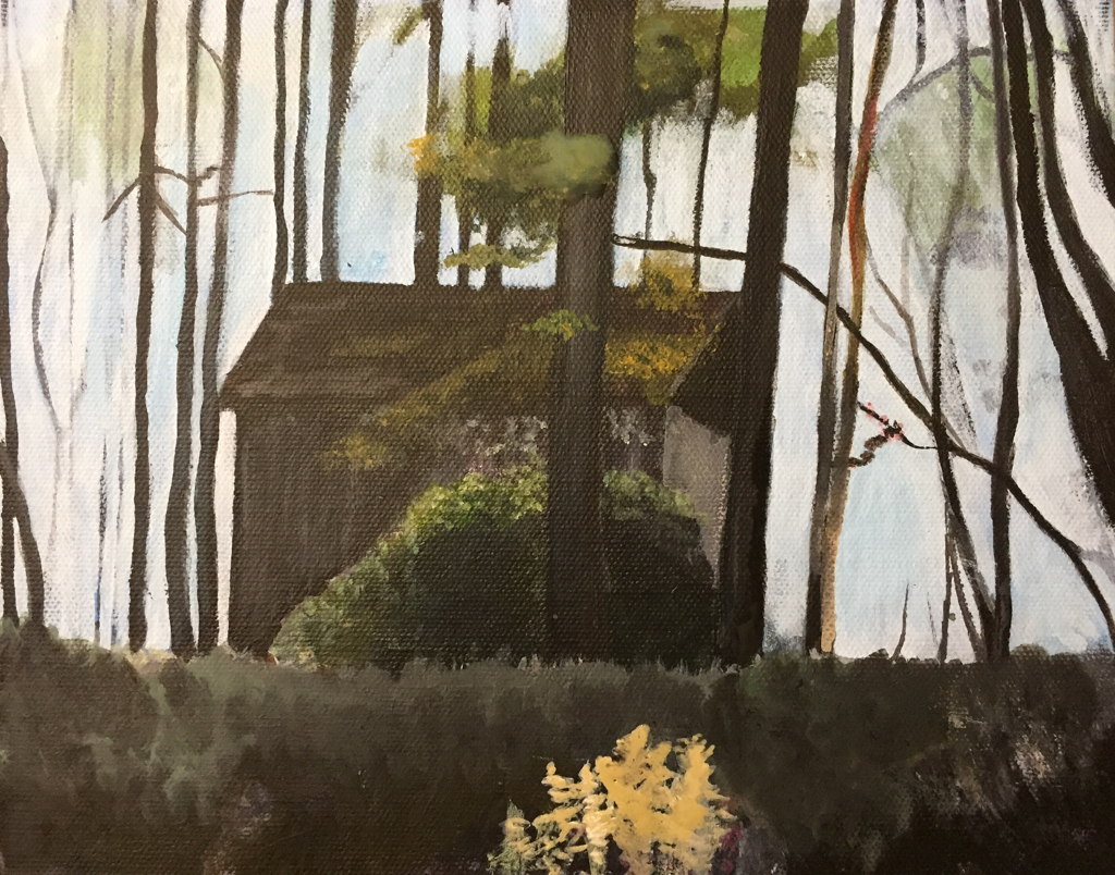 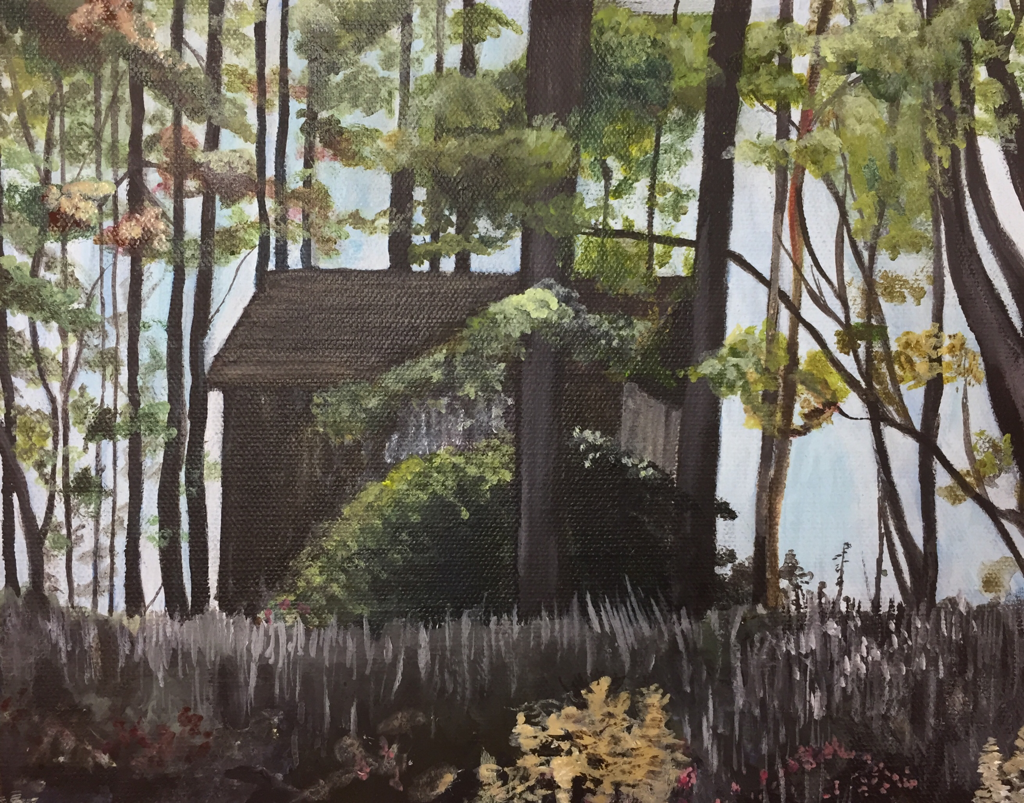 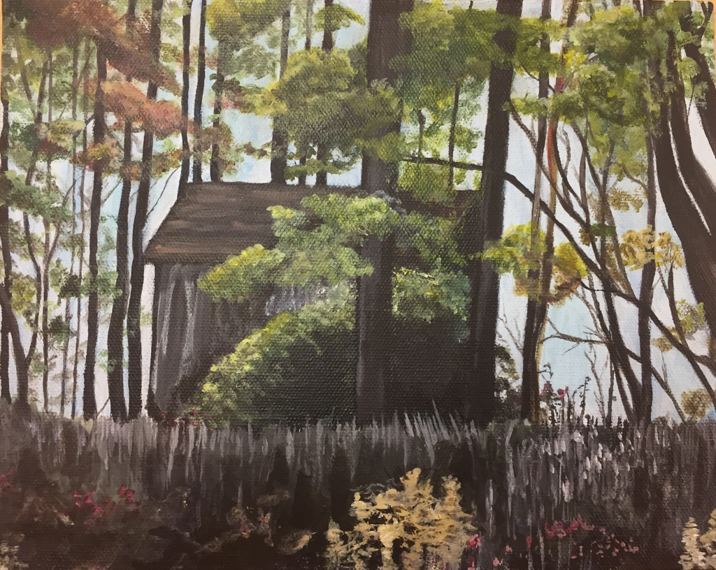 I did this landscape in acrylic paint on a gray-toned panel. The colors I used the most were vandyke brown, burnt sienna, white, red, cerulean blue, and lemon yellow. I used a lot of water with the paint to improve the flow and keep it smooth. This is the reference picture I used: 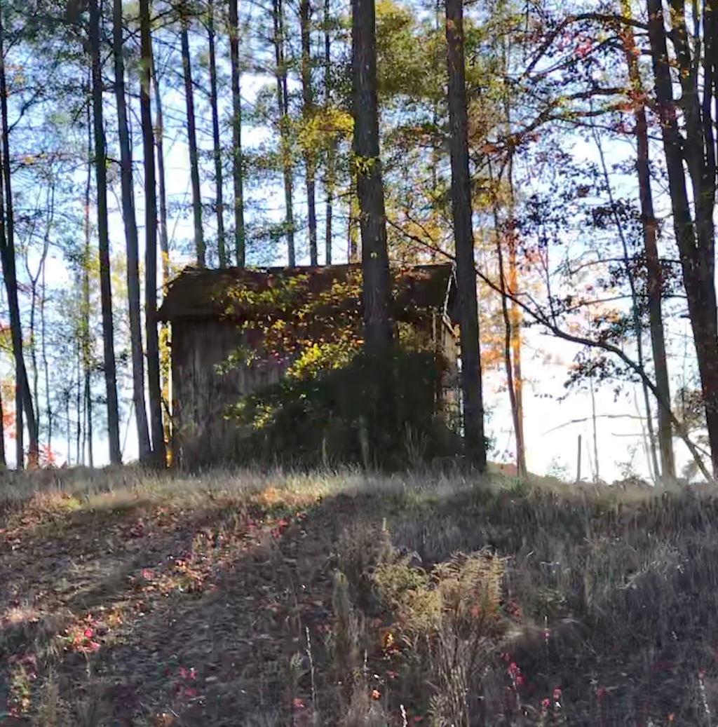 The picture is of the shed across the street from the main entrance to the school. I thought this project was fun to do and pretty easy, but I don’t know if it’s one of my best paintings.
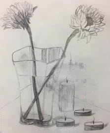
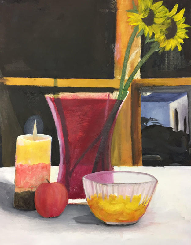
This is the reference photo I took: 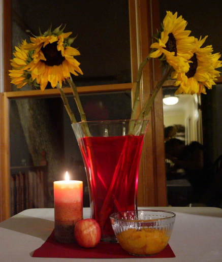 I mostly painted the candle from life, because the camera couldn't focus on the light well enough.
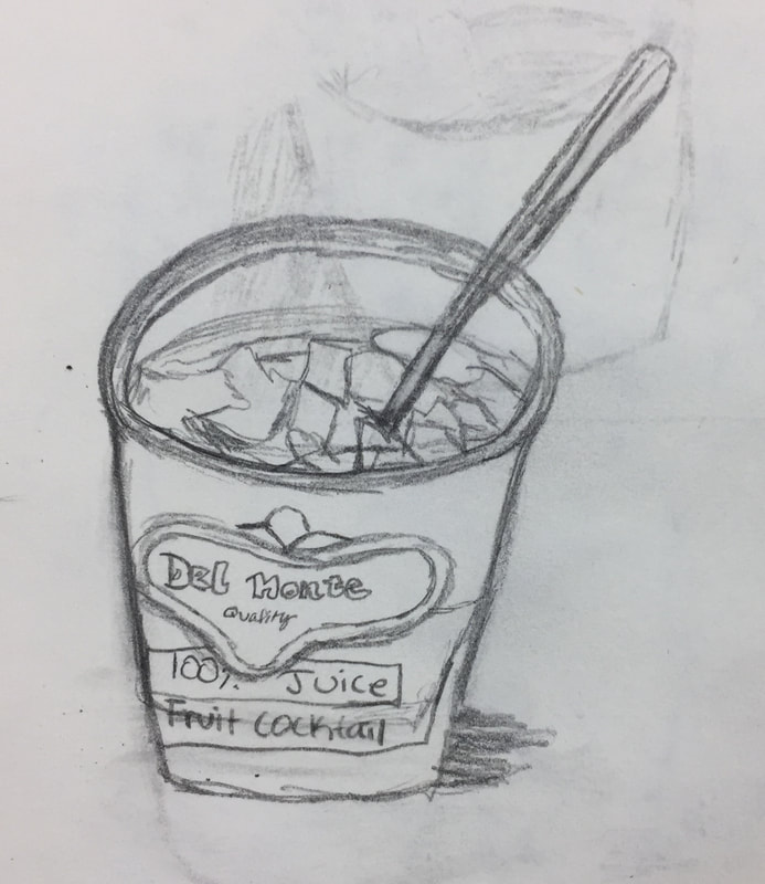
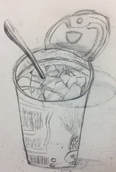
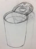
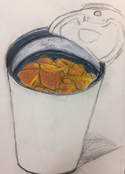
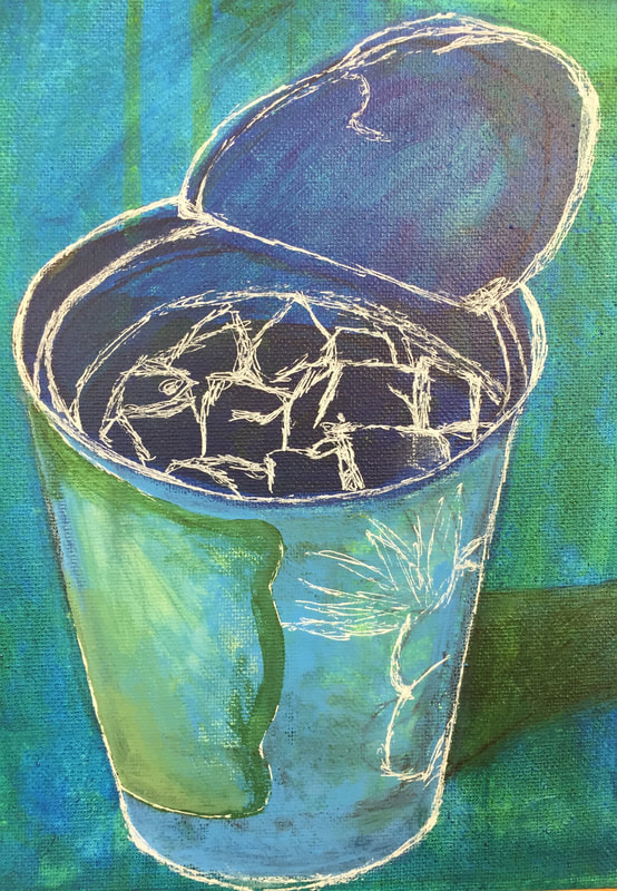 For this project, I took multiple pictures of a can and chose the one I liked the most. It took me several tries to get the shape right. I thought it would be interesting to paint the fruit inside of the can, and show how the light reflects on the metal. These are my sketches:
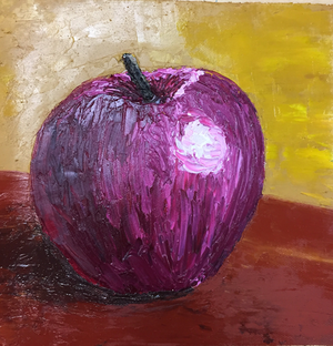
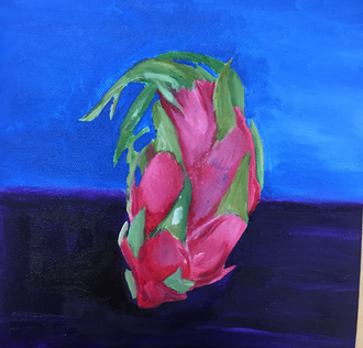
These are the oil paintings I did with a palette knife and regular brushes. The apple is the one I did with a palette knife, and it was the hardest one to do. Getting the shape right took a while, and I think it could be improved. The dragonfruit took more time to do but I like it better. Some of the blue paint got smudged onto the pink part. If I have time I want to go over some areas again on both paintings.
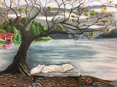
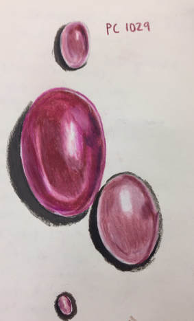
If I were to do this project again, I would probably change up the composition and do the leaves differently. I might do the sky first so I wouldn't accidentally smudge the branches while coloring in the background. I hope in the future I am able to do better detail work with prismacolor pencils. This is the original sketch I did for this project, and the gemstone practice:
If art can be defined as communication, then it's probably important to know what you are communicating. When I draw or paint something I'm not usually trying to get a specific message across, because I'm doing it for fun. I guess that in itself is a statement, though. Art is about self-expression and having fun is expressing yourself. I usually make art that conveys my emotions, unless it's for practice. You can manipulate the mood of a painting or drawing through style and color. The lines and color scheme invoke feelings in the audience just like an author's style does in a book. I think it's important to incorporate your emotions into your work, so it doesn't fall flat. People seem to like art better when it means something to them. The quality of a piece of art is entirely based on opinion, though. There is always going to be someone who hates your art and someone who likes it. I prefer art with a lot of color and emotion put into it, like surrealism, but what is good art and what isn't good art isn't really up to me.
|
AuthorWrite something about yourself. No need to be fancy, just an overview. ArchivesCategories |

 RSS Feed
