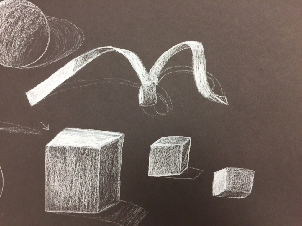
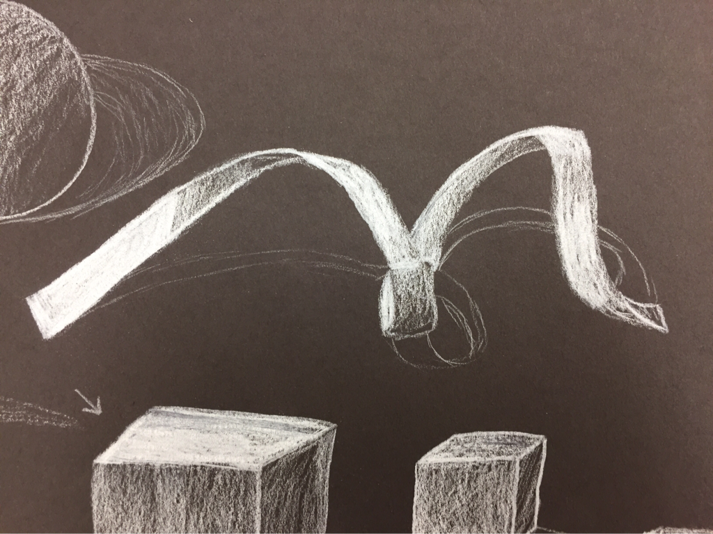
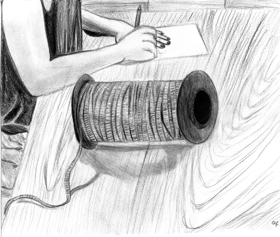
   These pictures are from the ribbon study I did with the white prismacolor. I liked using the white on black paper, but doing the shape of the ribbon was kind of hard. I think it is difficult to make shapes like that flow and not look ridgid. It's also harder to shade with white.
0 Comments
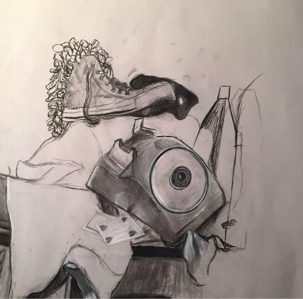 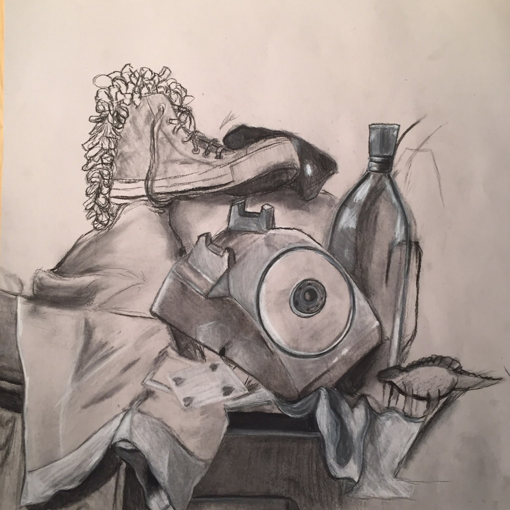  1. Describe the craftsmanship of your drawing. (Is it clear, clean edges, blended well, smudges, defined space, etc.) I believe my drawing is pretty clean. There aren't any major smudges or marks where there shouldn't be, and I did my best with shading and blending. I don't think there is too much negative space, and my lines are clear. 2. Are your values and shadows realistic? How many values did you include? How and why are values important? I tried to match my values and shadows to the still life set up exactly. I think I could probably have made the shadows more prominent/darker and the lighting more dramatic to add character to my drawing. I did use all the values possible, and they make my still life look clearer and more realistic than if i had used all light and medium values or all dark and medium values. 3. Is there a clear source of lighting? The source of lighting is very clear to me. The left side of the drawing has lighter values and more highlights, because that's where the light hits. I made objects farther from the light source darker and added less highlights to the things hidden behind bigger objects. 4. How important were the compositional sketches? Explain. The compositional sketches were very important because they helped me figure out which part of the still life I wanted to focus on. Without them, I probably would have put the focus in the wrong place or made the entire structure of my drawing displeasing to the eye. 5. How is your final drawing successful? My final drawing is successful because I added as many details as I could and put a lot of effort into the values and shapes in my work. I wanted it to be as realistic as possible, and I didn't want the lines to seem rough unless they were supposed to be. 6. Are the proportions, structure and perspective of the subject correct? There are some parts of my drawing that are not the exact size or shape as they were in the original still life, but I don't think that they are too noticeable. If I could go back and do it again I would fix the proportions, but when I was drawing it the first time I didn't notice until it was too late. 7. Does the placement & grouping of objects create a pleasing arrangement (composition)? I think the arrangement of objects works well. I like the amount of negative space I used and I think the outline looks pretty good. Still, my drawing would be better if I moved the phone a little farther right. 8. Is there a center of interest and is it well located? The center of interest is the area where the shoe and the phone are. I think they look okay, but the placement could be better. 9. How well did you manage your time and resources throughout the process of creating this drawing? Do you see where you could improve in this area? I think I managed my time and resources well, but I could have worked a little slower at first, as I drew some things a bit fast when I could have slowed down and made them better. 10. What challenges did you encounter during this project and how did you overcome them? Some of the biggest challenges I faced were drawing the inside area of the phone and drawing the texture of the fabric. I didn't have time to add the lace to the fabric, and there was so much detail it was intimidating. However, I did manage to make the inside of the phone look good even if it didn't match the reference exactly. 11. What have you learned drawing a still life? Drawing a still life gave me a better understanding of how shapes work together, and I'll probably do better on backgrounds in the future because of that. 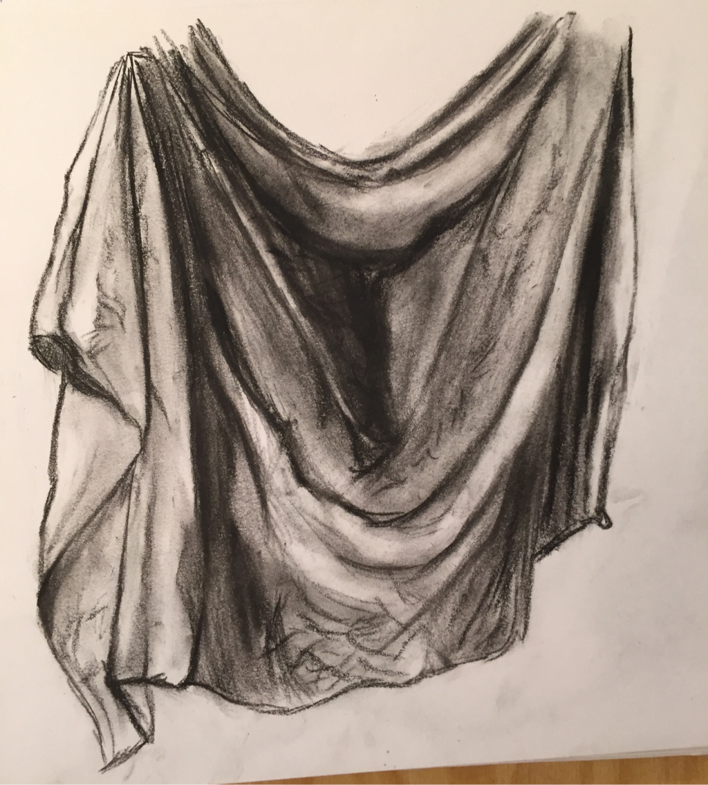 This is my first practice drawing in charcoal. The inside is a little messy. 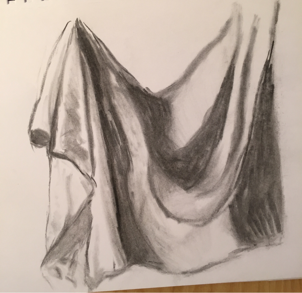 This is my practice drawing with the vine charcoal. I didn't get to finish it, but I like how it doesn't go on too dark. 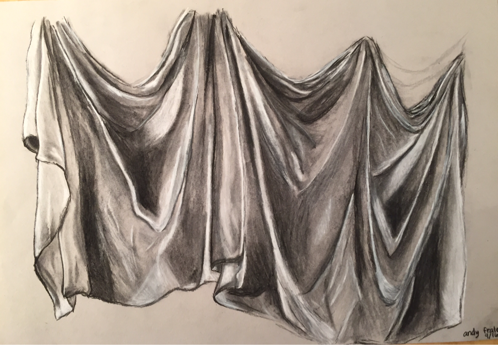 1. Did you use a wide range of values? (A range from white to black with at least 9 values). Explain how is this evident?
Yes, I made the very insides of the folds black but I made the values lighter where it blended out and where the light hit the fabric or shined through. All of the lines are clear and there is contrast. 2. Explain how your knowledge and creating practice studies with value contributed to your piece. I realized that there was light on each side of the sheet, and was able to draw what I saw and not what I thought would look nice. This way the fabric is thinner looking and not like a heavy blanket. Practicing helped me become aware of what worked and what didn't, and how much to blend and where to add values. 3. Describe the blending and transitions in your fabric (discuss your use of pressure with pencil/colored pencil/charcoal pencil and other techniques to achieve this). I blended a lot of the values out, but I made sure not to over-blend and make the lines too soft. I used the vine charcoal for the lighter shadows so they wouldn't end up too dark, and the charcoal pencil for the lines and darker shadows. I used the white charcoal lightly on areas that were light but not bright white, but I pressed harder on all the edges of the fabric that were bright white. 4. Explain how your interpretation of texture is essential in capturing the look of the object. I didn't make the fabric too smooth, because it's wrinkly, but I also didn't draw each individual wrinkle with the charcoal because the wrinkles are subtle. I tried to make most of the wrinkles evident using my blending stick and the white pencil over darker values. 5. If you could recreate your pieces what would you do differently to enhance the final outcome? I would make the inside of the sheet near the middle a little lighter and softer. I think there were times where I pressed too hard on the pencil. I also would sketch the whole thing out beforehand, instead of just one area at a time. I think some parts were too big. 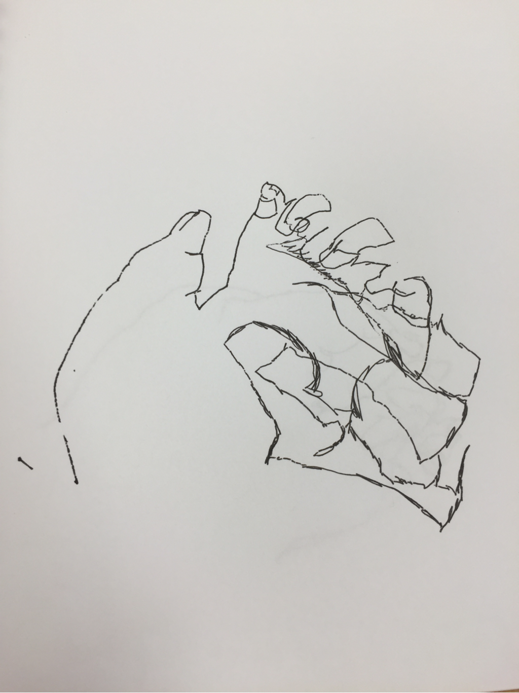 This is my second blind contour drawing. It was hard because I couldn't check to see where I was or what I had already drawn. The size is pretty accurate but the lines are all over the place. 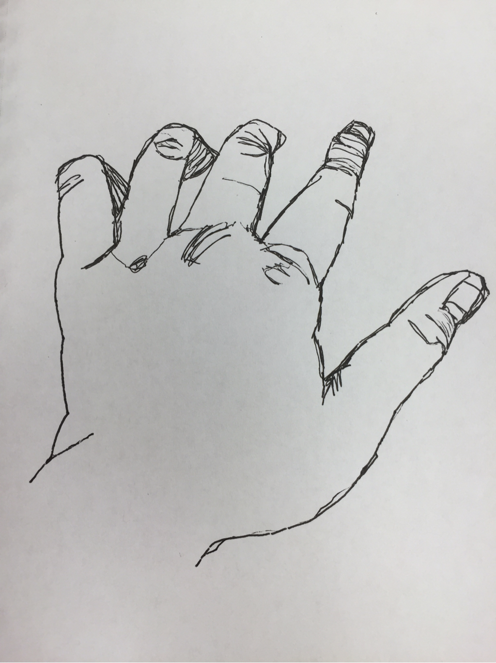 This is the second modified contour drawing I did. I like the shapes for most of the fingers. It was easier than the blind contour because I could look at the paper. 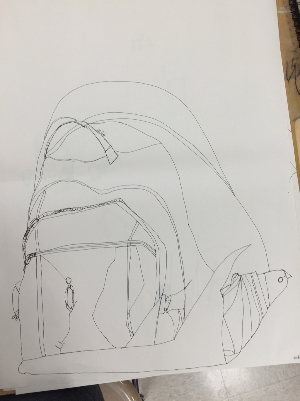 This is the backpack contour drawing I did. It was difficult to draw, because my backpack was pretty bulky and it was black so the lines were hard to see. 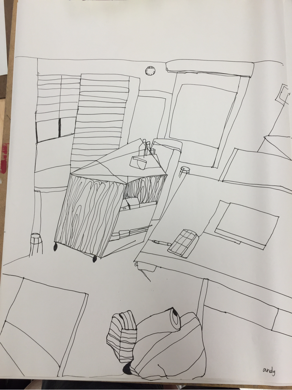 This is the practice room drawing I did. It definitely did mot turn out as well as the final room. The shapes are very crooked and messy. 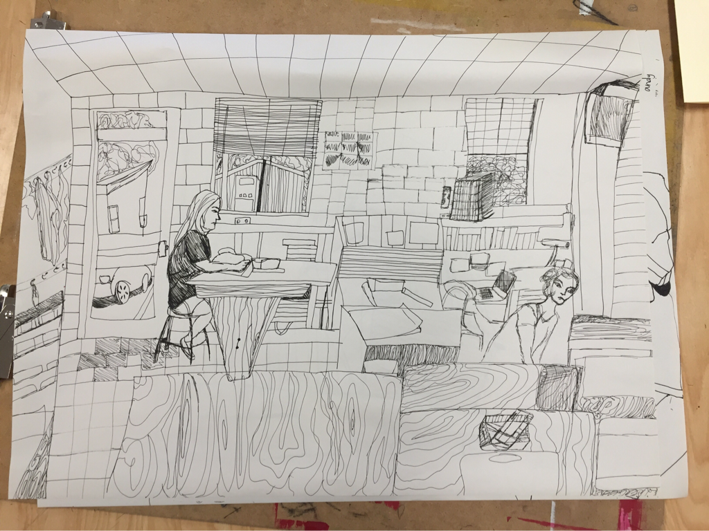 1. Did you use a fluid line? Explain how is this evident?
I tried to always use a fluid line, except for when I had to stop drawing or my pen started to dry out. You can tell because it isn't very sketchy. Even if the lines are a little shaky, it's clear they are connected. 2. Explain how your knowledge and creating practice studies with contour line contributed to the success of your piece. The more I practiced, the easier it became to draw the lines and add detail. Without practice, I didn't know where to start or what I was supposed to focus on, but once I began drawing I got the hang of it. There is more detail in my final drawing than any of the other ones. 3. Describe the difference in your contour line drawing to an outline drawing. My contour line drawing has the details and lines that are inside of the objects, and not just the outline. It doesn't just have the shapes of the objects, it has the textures too. 4. Explain how your interpretation of line is essential in capturing the look of the room. I had to be aware of which lines were the most important and where they moved in order to keep the drawing of the room an accurate depiction. If I changed the lines too much, it wouldn't be recognizable anymore. 5. What did you learn from completing this drawing? If you could recreate your piece what would you do differently to enhance the final outcome? I learned about perspective and how things are shaped depending on angle and location. If I could draw this again, I would make the lines cleaner and make sure the shapes stayed the right size. 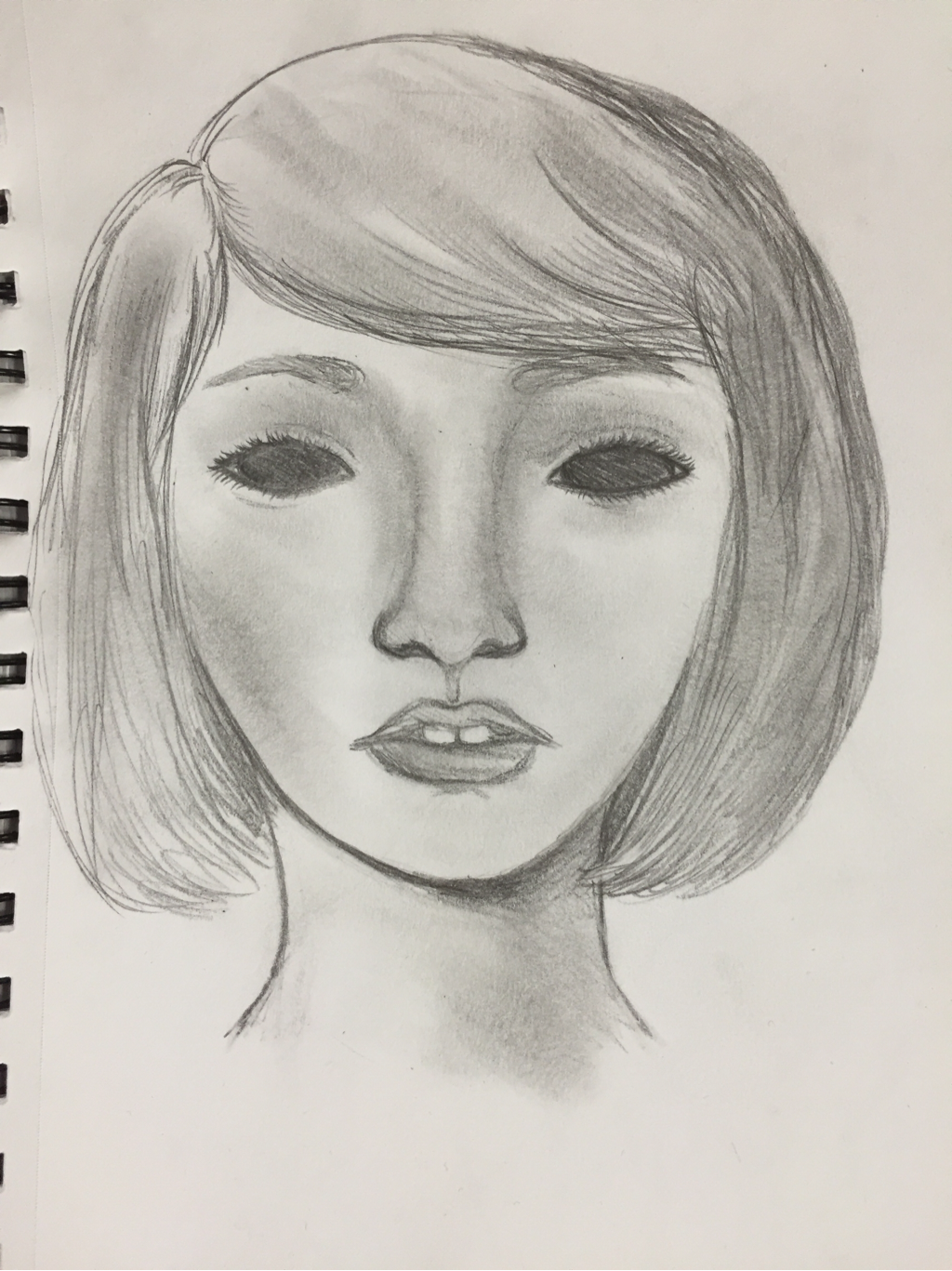 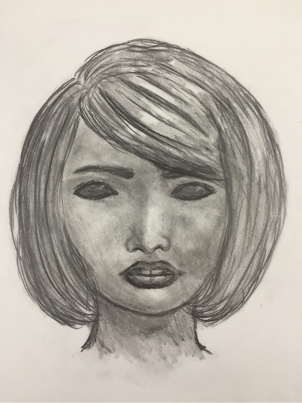 Why did you select this artwork to recreate and what did you decide to change to improve the original? Explain your thinking process. I chose this artwork because I thought it would be easier to gauge how much I have improved. It's a portrait, so there's a lot of shading and detail that goes into it. The original didn't have much detail and the lines were a little too solid. When I recreated it, I though more about shading and detail, and I looked up some reference photos so I could make sure the shapes and proportions were accurate. The eyelashes in the recreated version aren't as bold, and the nose is more shading than lines. The hair has more detail and better highlights and shadows. I made the neck shorter and the teeth not as bright. The person in the picture is based on a character from Tokyo Ghoul, but I didn't try to draw her exactly as the original artist did; I used my own style. 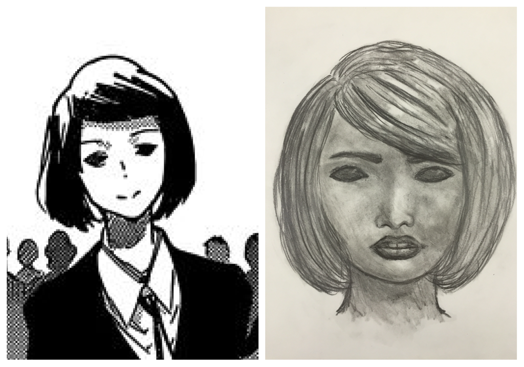 Original artist's vs. mine. How does the difference between the two works of art show your growth as an artist during this class? How do you think your art making ability has changed or improved? I think you can tell from the two works of art that I have a better understanding of how shading and shapes work. Before, when I was drawing hair I would just draw sketchy lines because I was trying to do the individual hair strands. Now, I draw the basic shape and then I go in and shade individual parts. Not all the lines are the same, because the hair isn't flat. Some parts are darker and some parts are kind of loose. I also know how to add in the highlights without making them look too sharp. I also improved the way I draw eyes. The lines are softer and the shape isn't usually perfectly defined. The eyelids usually aren't that wide if the eye is open. How do artists document the human experience through art? Use an image of your work or another artist's work for this question. 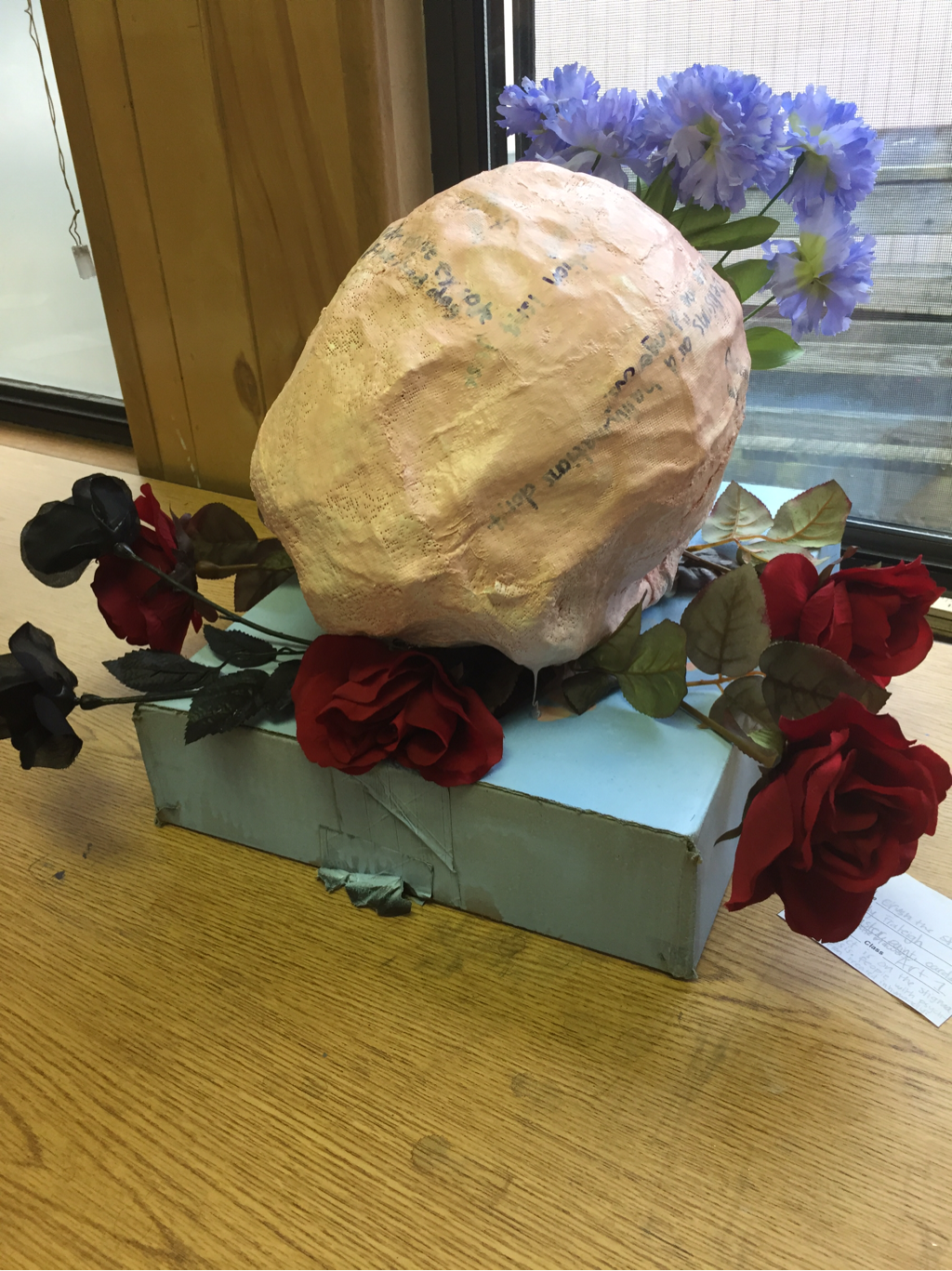 Artists document the human experience through art by making art about things they feel strongly about. Every piece of art could be about the human experience in some way; artists are human so anything they experience could be called "the human experience." All art has some degree of emotion in it, and artists often speak out about issues they experience or have seen people experience. Artists often use symbolism in their work. For example, I used a brain and my project was on psychosis. The flowers the brain is "crushing" represents the stigma about psychosis. I chose to do this because I have experience with battling that stigma; people with psychosis are often demonized and treated like they are dangerous or fragile. Part of this is the "psycho killer" stereotype horror movies and the media portray. "Psychotic" is often used as an insult or something that carries negative connotations, despite the fact that it is a medical term describing symptoms such as hallucinations, delusions, paranoia, etc. The words I wrote on the brain are all statements describing this. How have you used art to document the human experience in this class? Use an image of your own work here. 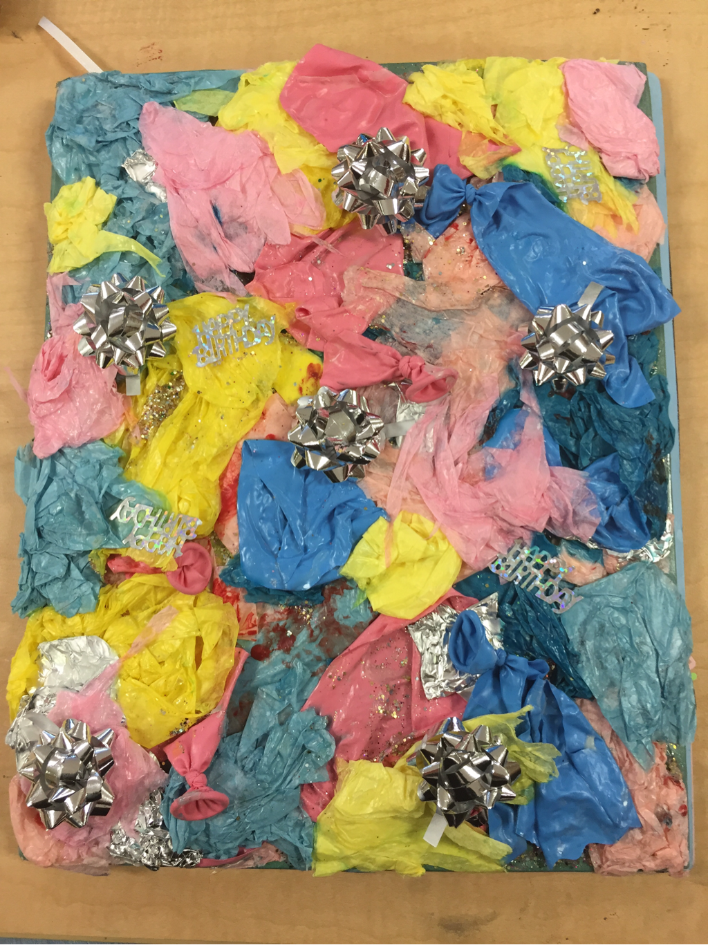 In the identity project, I documented the human experience by making a visual journal. The cover uses popped balloons, bows, tissue paper, confetti, and paint to create the feeling of a party. Parties are usually considered fun, but the red paint, made to look like blood, is supposed to illustrate that there are often darker themes behind both parties and birthdays. A lot of bad things happen at parties: fights, rape (especially at college parties), and anything else that could possibly happen when you have a large amount of people gathered together. Birthday parties, especially, can often be a turning point in someone's life. Abuse is such a taboo subject in society. No one wants to think about abuse victims, especially child sexual abuse victims. They cover it up and try to hide that it happens to so many people.
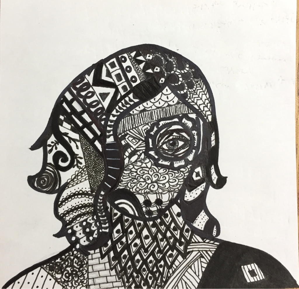 1. What are some different ways to interpret line? What did you learn by thinking of line in different ways? There are many ways to interpret line. Lines can be straight, thick, thin, or even wavy. Lines can create simple patterns, but they can also create complex images, like landscapes or portraits. I learned that lines don't have to be too bold when you use them in art. All art uses some lines, even if you don't notice or think about it. 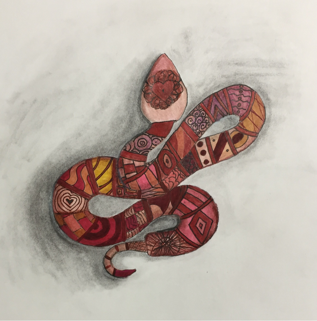 2. How do you feel about your final artwork for this unit? What do you like or dislike about it?
I think it's pretty good. I like the shading the best, and the shape. I'm not very happy with the line-art. I think I should have used brown or red instead. Maybe subtler colors, too. I do like the patterns, though. 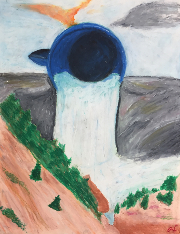 1.) What new skills did you learn or what did you improve on during this unit? I learned how to draw waterfalls, and that most of the water is foam. I also learned that I hate oil pastels, and that it's hard to blend them because they clump up. The only good thing about oil pastels is that the color goes on solid and the white is helpful for mixing colors. 2.) How has your thinking about what original art is changed? My thinking hasn't changed much. It is fine to take and reinvent ideas, or take ideas and make your own art with them. Physically stealing art, like taking someone's work and saying you did it, is wrong, but being inspired or working off of it is okay. Taking a photo and using it as a reference is all right, too. 3.) What challenges or successes did you have during this unit? Would you change anything you did if you could go back and re-do it? One of the challenges I had was drawing the land and the trees. It was hard making everything look like it did in the photograph, and there were times where I felt like the project looked like a little kid drew it. The waterfall is something I'm actually proud of, and the cup is okay, but I'm not satisfied with the shading on the inside. If I could re-do it, I would definitely go in with a lighter hand. I didn't know the oil pastels could clump up so fast. I would definitely put less black in the shading of the cup. 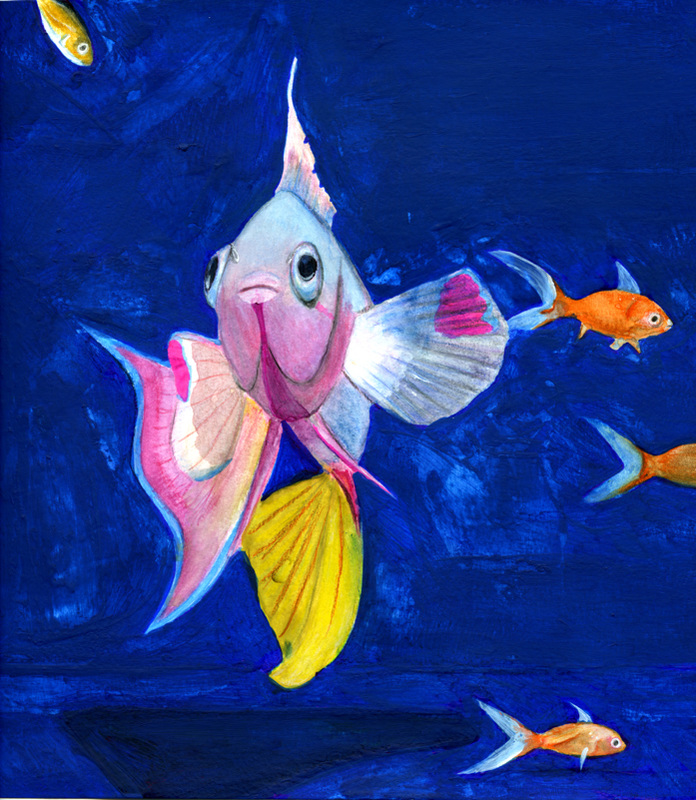 For the final project on space, I painted a saltwater fish in a goldfish tank with watercolor paints. I thought it would look interesting and out of place with the freshwater fish. The project I chose was "realistic space," and I think I did as best as I could at the level I'm on now to make the picture look as real as possible. The background was the hardest, because for some reason, certain areas wouldn't let the paint stick. First I used watercolors, and when those didn't work, I used acrylics, but the acrylics didn't work well on top of the watercolors. I think I might have wet my brush too much originally. I learned how to shade with paint this week. To make the yellow on the bottom fin look shadowy, I mixed purple in with the yellow. I also used green with the pink for the same purpose. I really liked doing the goldfish. I think they were the most fun, and ended up looking pretty good.
Haejin Lee makes sculptures that look like they're unraveling. Her art is very interesting and surreal, and the sculptures are definitely complex. They would be interesting even if they were paintings, but the fact that they're 3D somehow makes the work even more appealing. 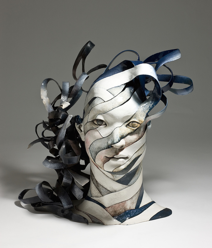 Christopher David White makes sculptures that look exactly like they were made from trees, despite the fact that they are ceramic. He, like Haejin Lee, makes very complex and surreal art. White combines human features with tree-like textures and shapes, merging nature and humanity in a single sculpture. 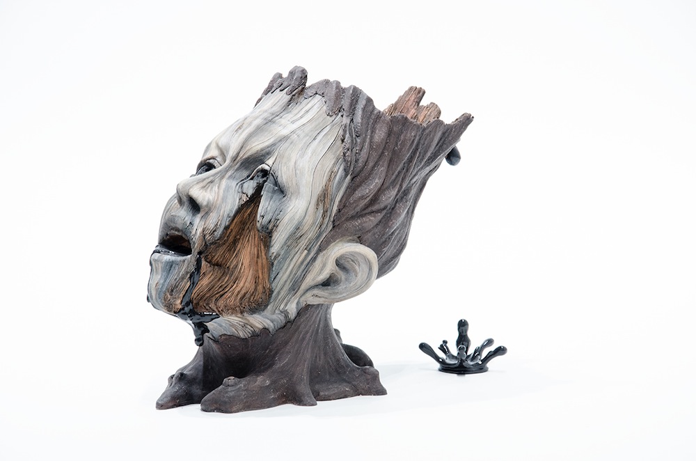 |
 RSS Feed
