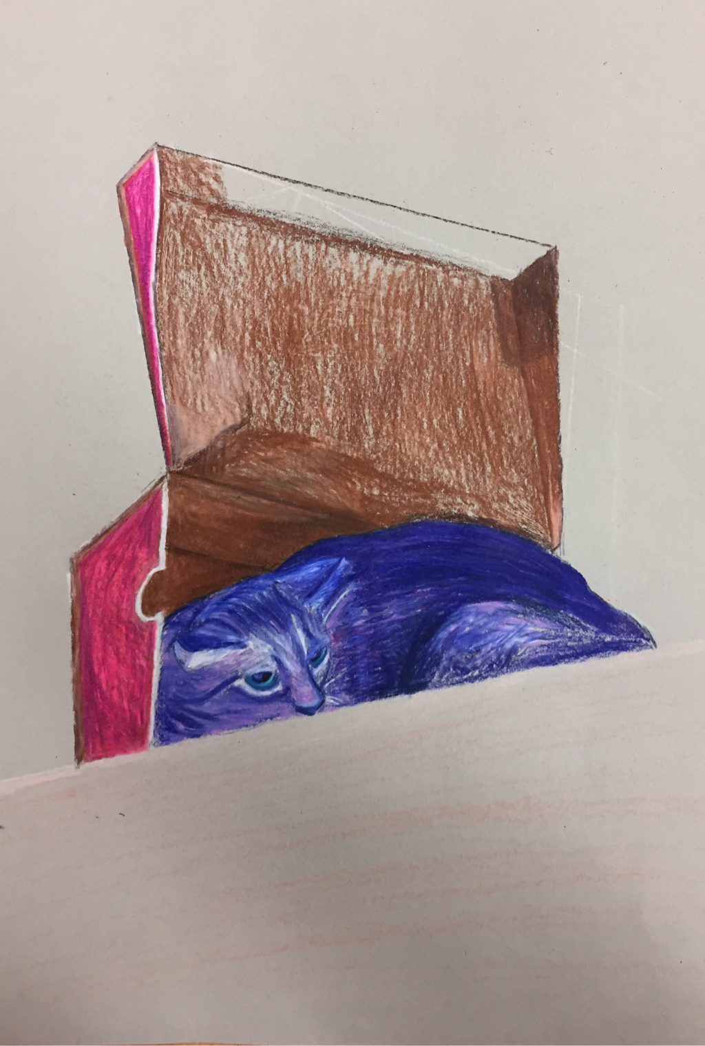
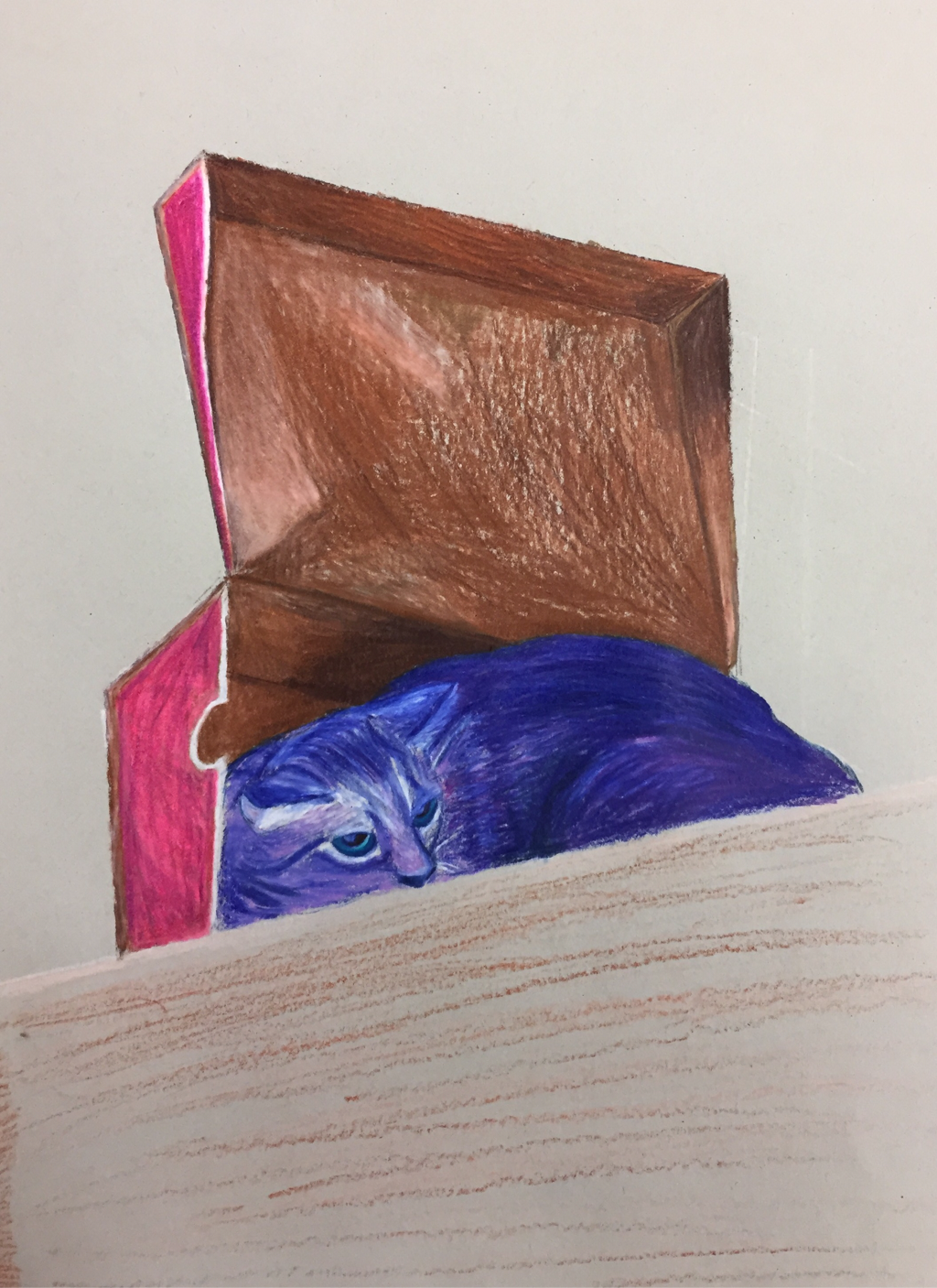
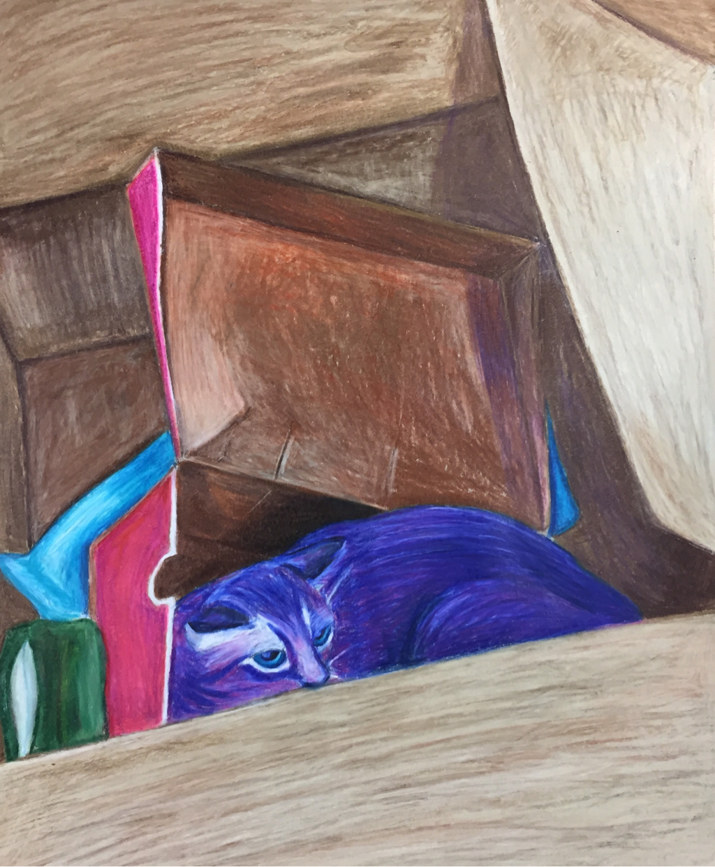
    1. Describe how you created an interesting point of view? Was it successful? Why or why not?
I drew a cat inside a box inside a bigger box, and I think it's interesting because the boxes are at different angles. It would have probably looked better if I had zoomed out more, but I like the way it's set up. 2. Why is it important to understand perspective and how to draw it? If you understand perspective your art can be more accurate and look interesting. 3. How were the colored pencil exercises important in the success of your piece? They helped me understand how to better shade and techniques to use. 4. Describe the craftsmanship of your colored pencil. What techniques were used? (How well the project is technically crafted). I colored in the direction the object was going; like with the boxes, I made sure to use straight lines. I also used layers of different colors. Some of it was messy looking, though. If I could do it again I'd try to go smoother. 5. Were you able to achieve depth by showing a foreground, middle ground and back- ground? Explain. Yes, I think you can see the depth pretty well. Some areas could be darker or lighter, but it doesn't look terrible. I made sure to have both a foreground, middle ground, and background, and I tried to shade them so you can see distance. 6. Explain your experience with colored pencil and the project in general. What were the obstacles and advantages? I liked using colored pencils, but it was much harder to blend the colors and make the lines smooth than with paint. However, using color instead of graphite pencils made it easier to show things like fur or light. 7. Looking back on the progression of this project what skills, techniques or other information would you like to have been taught? Do you feel you were prepared for this project? I wish I had been taught how to better shade and make the colors and lines smoother. I learned a lot from this assignment and could probably do it better if I tried again.
0 Comments
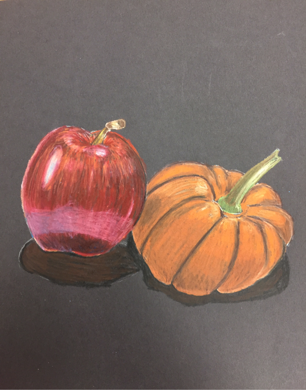 These are the apple and the pumpkin that I drew together in colored pencil. I think everything looks good except for the highlights on the apple. Hopefully in the future I'll get better at showing lighter values. 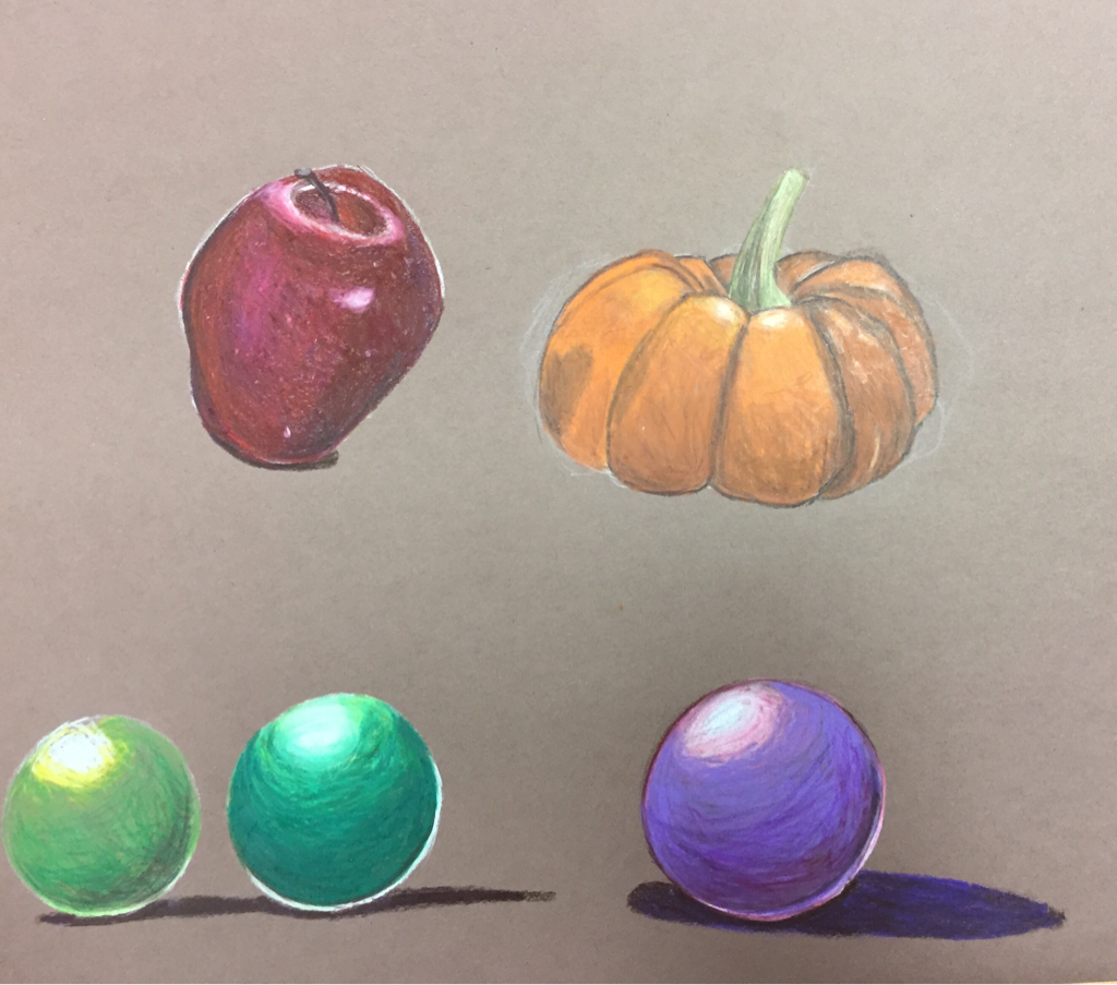 These are the first studies I did. I don't like the values on the apple.
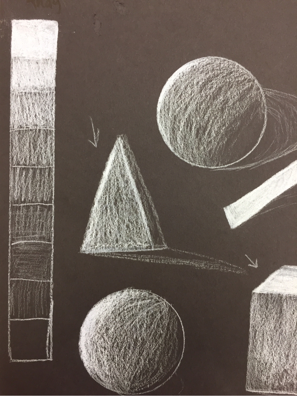
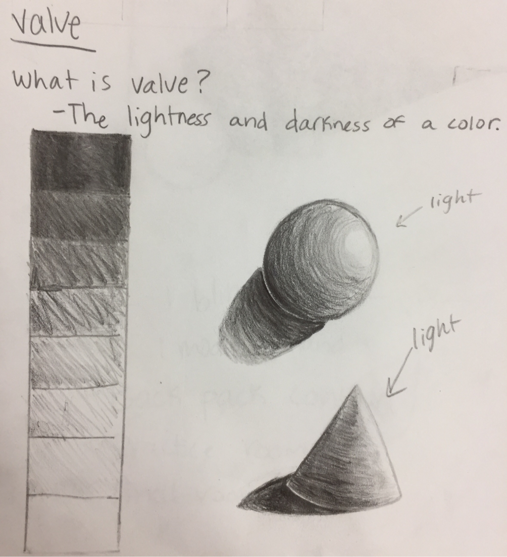 This is the value chart and a sphere and cone I drew with the values. I think these would be a lot better if I drew them now. 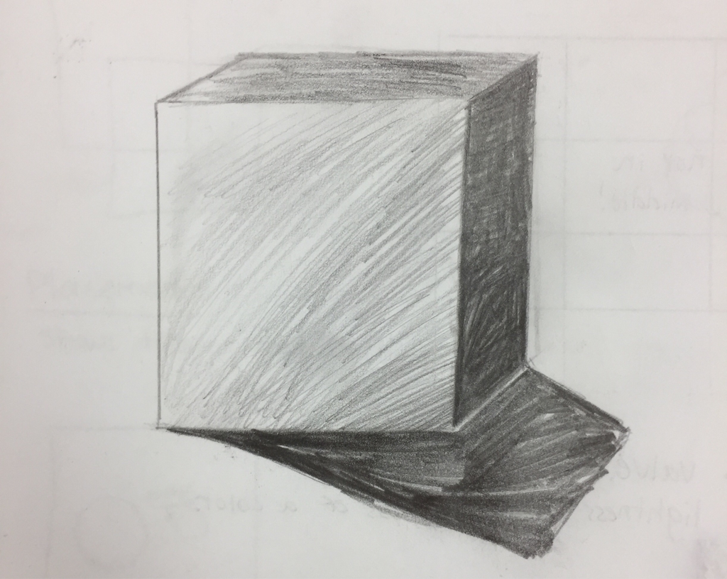 Here is a cube I drew with the values. The blending isn't very smooth. 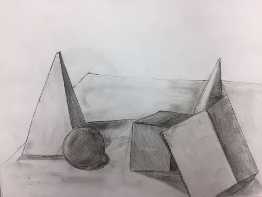 Here is the value study I did with the objects that were placed on the table. I don't like it very much, and I think the shading and blending could be a lot better.
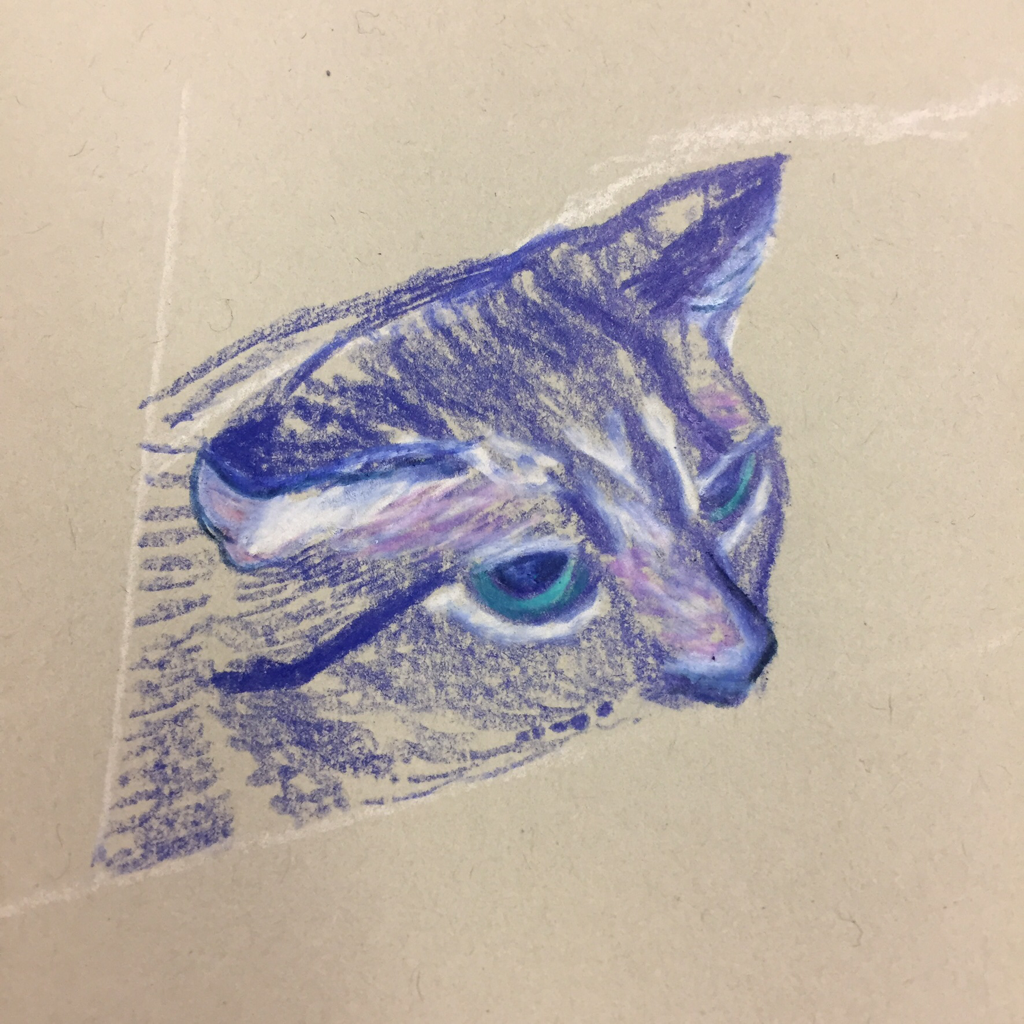
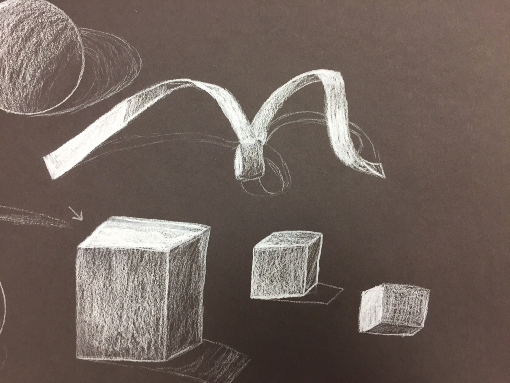 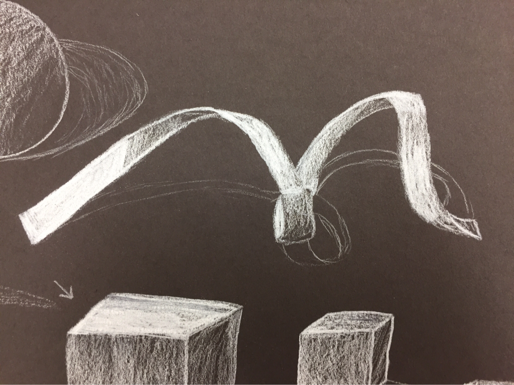  These pictures are from the ribbon study I did with the white prismacolor. I liked using the white on black paper, but doing the shape of the ribbon was kind of hard. I think it is difficult to make shapes like that flow and not look ridgid. It's also harder to shade with white.
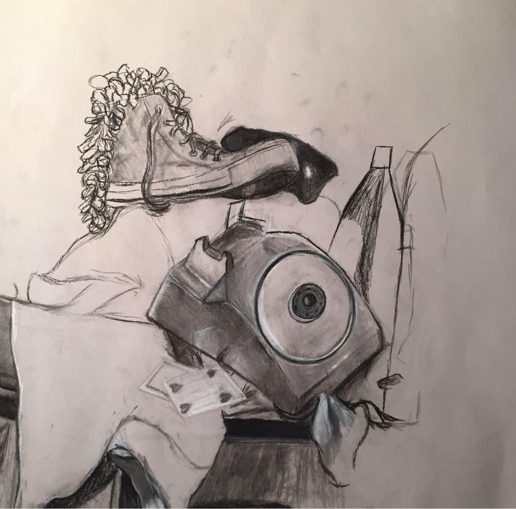 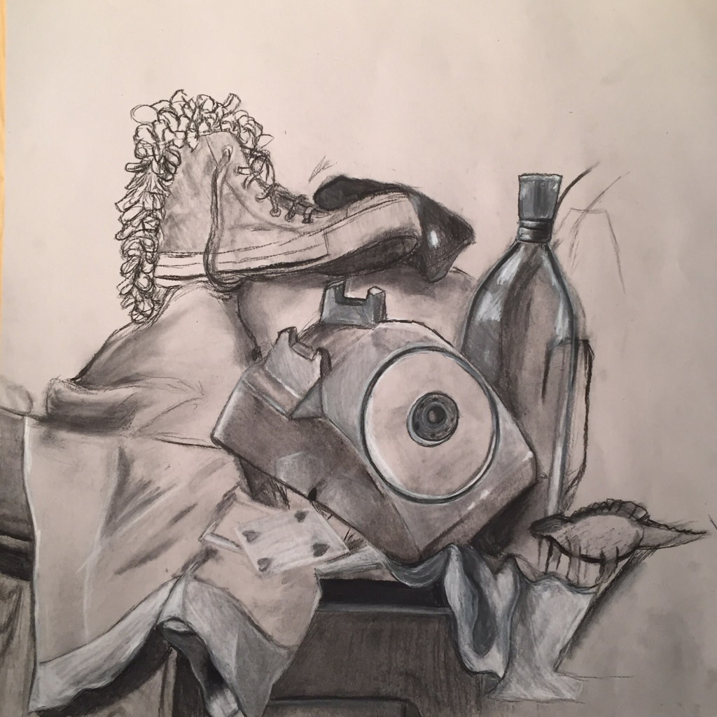 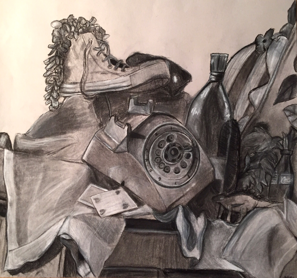 1. Describe the craftsmanship of your drawing. (Is it clear, clean edges, blended well, smudges, defined space, etc.) I believe my drawing is pretty clean. There aren't any major smudges or marks where there shouldn't be, and I did my best with shading and blending. I don't think there is too much negative space, and my lines are clear. 2. Are your values and shadows realistic? How many values did you include? How and why are values important? I tried to match my values and shadows to the still life set up exactly. I think I could probably have made the shadows more prominent/darker and the lighting more dramatic to add character to my drawing. I did use all the values possible, and they make my still life look clearer and more realistic than if i had used all light and medium values or all dark and medium values. 3. Is there a clear source of lighting? The source of lighting is very clear to me. The left side of the drawing has lighter values and more highlights, because that's where the light hits. I made objects farther from the light source darker and added less highlights to the things hidden behind bigger objects. 4. How important were the compositional sketches? Explain. The compositional sketches were very important because they helped me figure out which part of the still life I wanted to focus on. Without them, I probably would have put the focus in the wrong place or made the entire structure of my drawing displeasing to the eye. 5. How is your final drawing successful? My final drawing is successful because I added as many details as I could and put a lot of effort into the values and shapes in my work. I wanted it to be as realistic as possible, and I didn't want the lines to seem rough unless they were supposed to be. 6. Are the proportions, structure and perspective of the subject correct? There are some parts of my drawing that are not the exact size or shape as they were in the original still life, but I don't think that they are too noticeable. If I could go back and do it again I would fix the proportions, but when I was drawing it the first time I didn't notice until it was too late. 7. Does the placement & grouping of objects create a pleasing arrangement (composition)? I think the arrangement of objects works well. I like the amount of negative space I used and I think the outline looks pretty good. Still, my drawing would be better if I moved the phone a little farther right. 8. Is there a center of interest and is it well located? The center of interest is the area where the shoe and the phone are. I think they look okay, but the placement could be better. 9. How well did you manage your time and resources throughout the process of creating this drawing? Do you see where you could improve in this area? I think I managed my time and resources well, but I could have worked a little slower at first, as I drew some things a bit fast when I could have slowed down and made them better. 10. What challenges did you encounter during this project and how did you overcome them? Some of the biggest challenges I faced were drawing the inside area of the phone and drawing the texture of the fabric. I didn't have time to add the lace to the fabric, and there was so much detail it was intimidating. However, I did manage to make the inside of the phone look good even if it didn't match the reference exactly. 11. What have you learned drawing a still life? Drawing a still life gave me a better understanding of how shapes work together, and I'll probably do better on backgrounds in the future because of that. |
 RSS Feed
