|
|
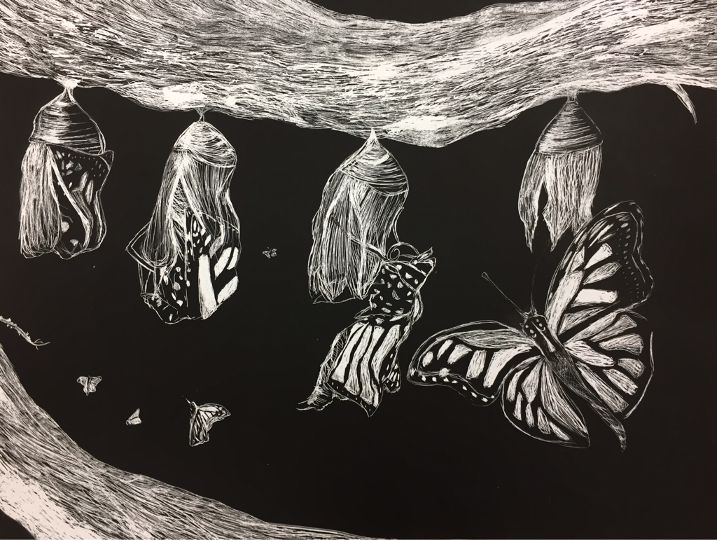
This is the project I did for the scratchboard assignment. I think it's one of the best I've done this year, probably because it's the most recent so I've had more practice than I did with all the others. It was hard because I've never done something like this before, and you can't erase things from a scratchboard if you make a mistake. This was my first time drawing butterflies and it was kind of stressful because they're usually supposed to look pretty symmetrical. It's also hard to get the proportions right.
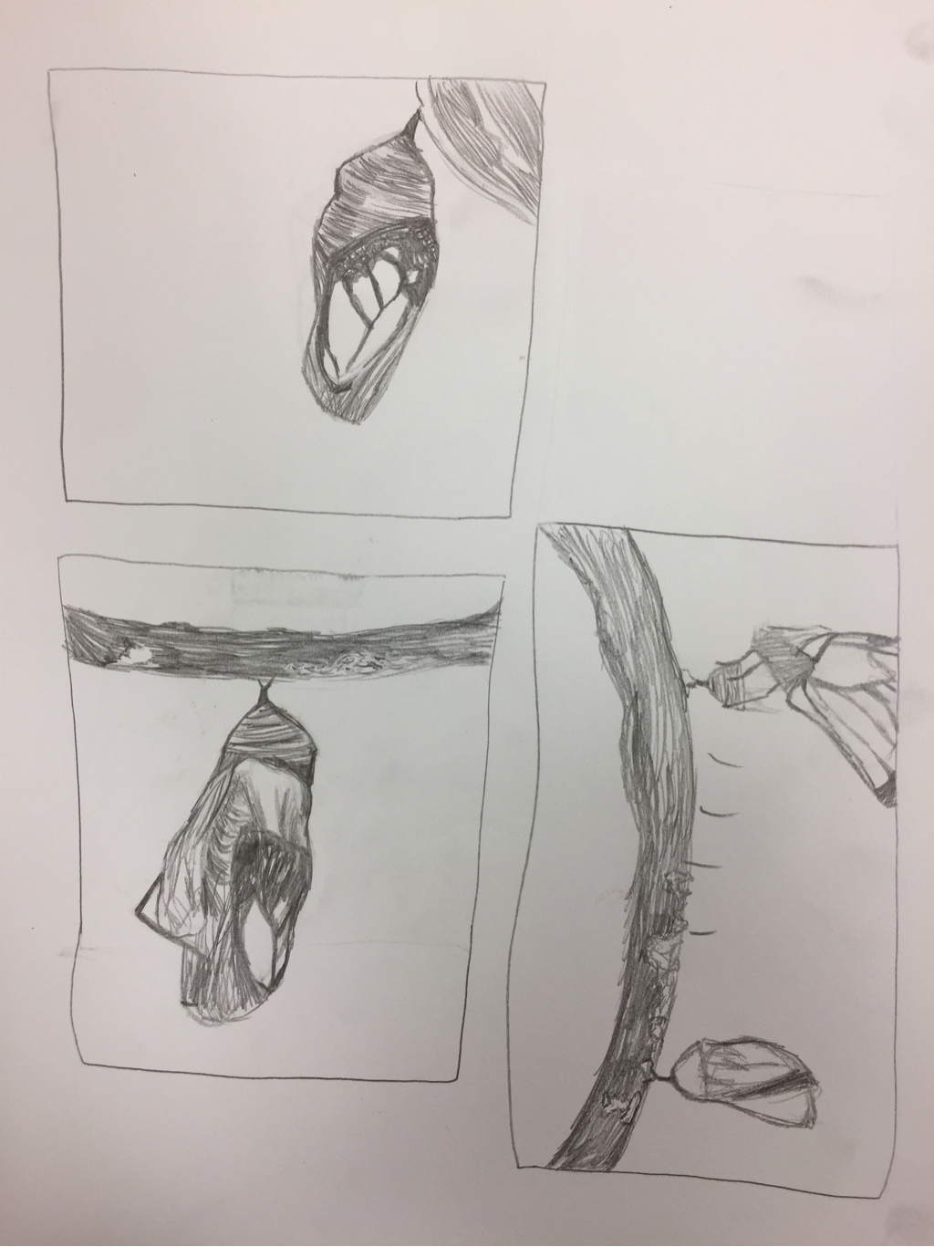
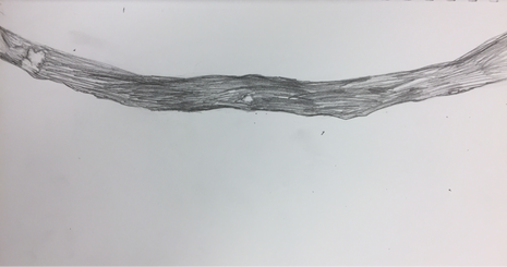
Originally, I was going to do moths flying around a lightbulb, but I wasn't sure how to do the lightbulb, because it would require a lot of softer values. I eventually decided to do cocoons, and added the butterflies flying around so there would be implied movement. I thought the bark on the branches would look really cool on the scratchboard, and I used the red tool and the rake-like tool to create the texture. I left some lighter chunks to show how mossy the branch is.
My favorite part of this drawing is probably the second cocoon on the left, where the butterfly isn't out of the cocoon yet. I really like the lighting and how the cocoon almost blends into the butterfly's wing. I think this cocoon is the best one, and it looks a lot smoother. I also like the butterfly on the third cocoon, because I think I did a nice job of showing how thin and weak its wings are at this stage. They almost look like fabric or tissue paper to me. I think the shading on its wings is a lot better than the shading on the largest butterfly's, probably because I did it last and new what not to do. I also like the branch the cocoon is on. I think the bark turned out very nice.
The biggest reason this drawing catches my eye is probably the texture. It's very high-contrast, so it pops more, and the texture is bolder because I couldn't blend anything. It was a challenge to draw this, but I liked it a lot and will probably try using a scratchboard again in the future. If I could do it again it would probably look a lot better, now that I've had practice.
2 Other Questions:
2. Look at your body of work over the semester and choose 2 pieces that show your growth as an artist. Discuss each piece and how you grew in the following areas: application of materials, techniques and skills, artistic vision, use of the principles and elements, creativity, intuition and subject matter.
|
|
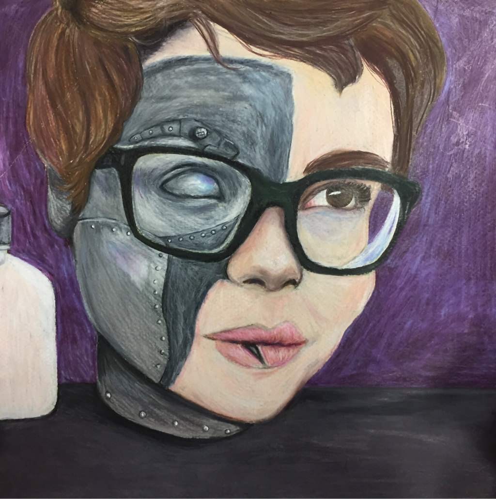
These are two drawings I did with the Prismacolor pencils. The first one is the "Look At That View" project and the second one is the self-portrait project. I think the second one is a lot better than the first one, especially when it comes down to blending and mixing colors. The first one looks messy and the lines are awkward and uneven. The shadows aren't dark enough and the highlights aren't bright enough. The cardboard is too warm in color, and the shapes aren't drawn correctly. The second one has better shading and blending, and the shapes are cleaner and neater. It got easier for me to add texture to things, and the colors I used don't clash. I think I also improved at creating a more interesting picture. The quality is pretty consistent throughout the portrait. There aren't too many lines that are out of place. I think my technique with colored pencils has been improving a lot.
4. Look over the blogs of other students in our class. Choose a piece of artwork from one of your classmates that you feel is an exemplary showcase of what the project was to depict. Think about how the artist used the medium, utilized the elements of art and design principles, was original with their ideas and went beyond their comfort zone or the realm of the requirements. Make sure you have the image of their artwork along with their name (first name only) posted with this response.
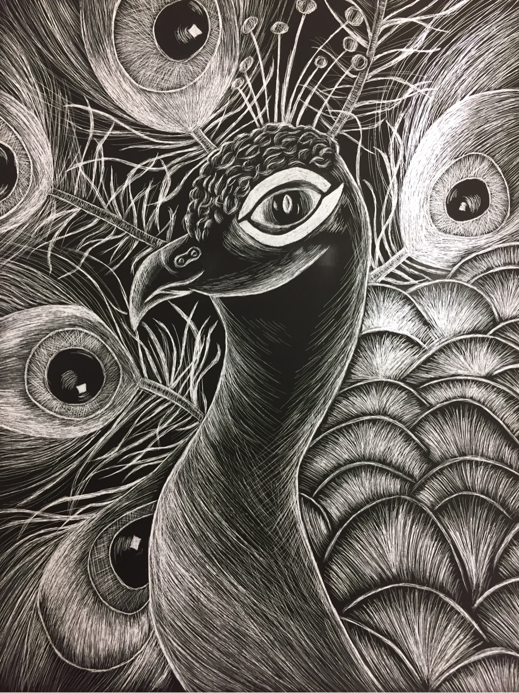
This is the drawing Lacey did for the scratchboard project. I chose her drawing because I think the texture, especially in the big feathers, is amazing. She managed to make her drawing kind of stylized without having it look flat. There are a lot of different values, and you can tell she put a lot of effort into this drawing. I like the wavy feathers that are branching off from the main feathers, and how detailed they are. They don't look stiff at all, and flow very nicely. I think she made a good choice in leaving some areas on the peacock black. It really makes the lighter areas stand out. I also like how she added highlights to the eyes on the feathers, making them look shiny and almost wet. Lacey has a very steady hand and her lines and the small details are really well done. Usually there isn't as much detail in her work due to the style of her drawings, but it's clear she can do detailed work as well.
